Tuesday, December 11, 2007

Two Charts of the TSX

We all know what happened today, so I won't go into the details. In this post I'll just show two charts that may give you a perspective not shown in other sites. Firstly, we have a daily a chart of the TSX:


You'll have to click on the chart to read the annotations. The main thing is that the TSX failed at the confluence of two sources of resistance, and that the candlestick put in today is bearish.

Now, let's have a look at an intra-day chart of what unfolded. In this chart, each candle represents 5 minutes of price action and it covers three days.


Also worth mentioning is that every sector was hit today, and gold stocks did not escape the carnage today. Gold stocks are at a very important juncture as suggested in the last post. A defensive viewpoint is definitely warranted at this time. Thanks for visiting.

Sunday, December 9, 2007

GDX, The HUI, and Barrick Gold

Gold was up marginally this week, and North American gold stocks were more or less unchanged. Gold stocks have been treading water for a while now, but probably not for much longer, as this post will show.

First let's have a look at the Gold stocks ETF, GDX. This is a daily chart that covers about 6 months of price action:


The annotations should be self explanatory, so I won't go into too much detail. But one thing I wanted to point out is that the Bollinger Bands are beginning to tighten, which means that volatility is dropping. What often happens is that volatility contractions precede price break outs.

If you observe the above chart you will notice that GDX is sandwiched between solid support and solid resistance. Any breakout from this zone would be a strong buy/sell signal.

Obviously, whether the Fed cuts rates by 25 basis points or 50 basis points will help determine which direction the breakout will be, but let's also look at more charts for additional clues.

What the Bollinger Bands cannot forecast is what direction breakouts will occur in. For that, we must rely on other clues, which are in the next chart. The next chart is also a daily chart, but of the HUI:


This is a similar looking chart, but this chart has additional annotations. In my opinion, a bearish head and shoulders pattern has formed in this chart.

Every week I read dozens of other analysts opinions of the gold stocks market. What I find surprising is that no one else has noticed this pattern, as far as I can tell. I think that the reason for this is because most analysts are bullish on gold, and their minds are screening out anything bearish that appears on the charts.

Even fundamental analysts, like the ones on Bloomberg, are all bearish on the dollar, and bullish on gold. This is definitely an ominous sign for gold bugs. These are the same guys that come out and declare that the gold bull market is over every time there is a correction, like last August.

That being said, the long-term fundamentals for gold and silver are still, like always, intact. For the next ten years, gold and silver will likely outperform every other asset class. Gold stocks will likely do well too. In fact, here is a long term bullish perspective on one gold stock in particular, Barrick Gold:


The above chart is a weekly chart, and it goes back to around 2002. It is a relative strength chart, that compares ABX to the TSX Composite Index. As you can see, ABX has been under performing the TSX for about 6 years.

What is interesting is that Barrick's relative strength has broken out of its channel, and has started outperforming the TSX. That is certainly bullish for the long term.

By the way, I am experimenting with a new layout for this site. The objective is to make this site look more like a 'real' website rather than a blog. If you prefer the old look, please write a comment.

Thursday, December 6, 2007

A Quick Look at Kinross Gold

This is a chart that caught my eye today, so I thought I'd make it apart of a mini post. The following chart is a daily chart of Kinross Gold. You will have to click on the image to get a more legible view.


The main point I wanted to make in the above chart is that Kinross is bouncing off overhead gap resistance at the $18.50 mark. The recent price action also appears to be forming some sort of pennant, which would be bearish if there was a downside breakdown.

In addition, volume appears to be waning, which could be viewed as bearish. These bearish developments would be negated however if Kinross exceeded its recent pivot high point. More to come on Sunday.

Saturday, December 1, 2007

Gold, Crude Oil, and the US Dollar

For this past week, gold lost $35.60, and gold stocks, as measured by GDX, lost 5.10%. In this post, I will show more evidence that commodities and gold stocks are in corrective mode.

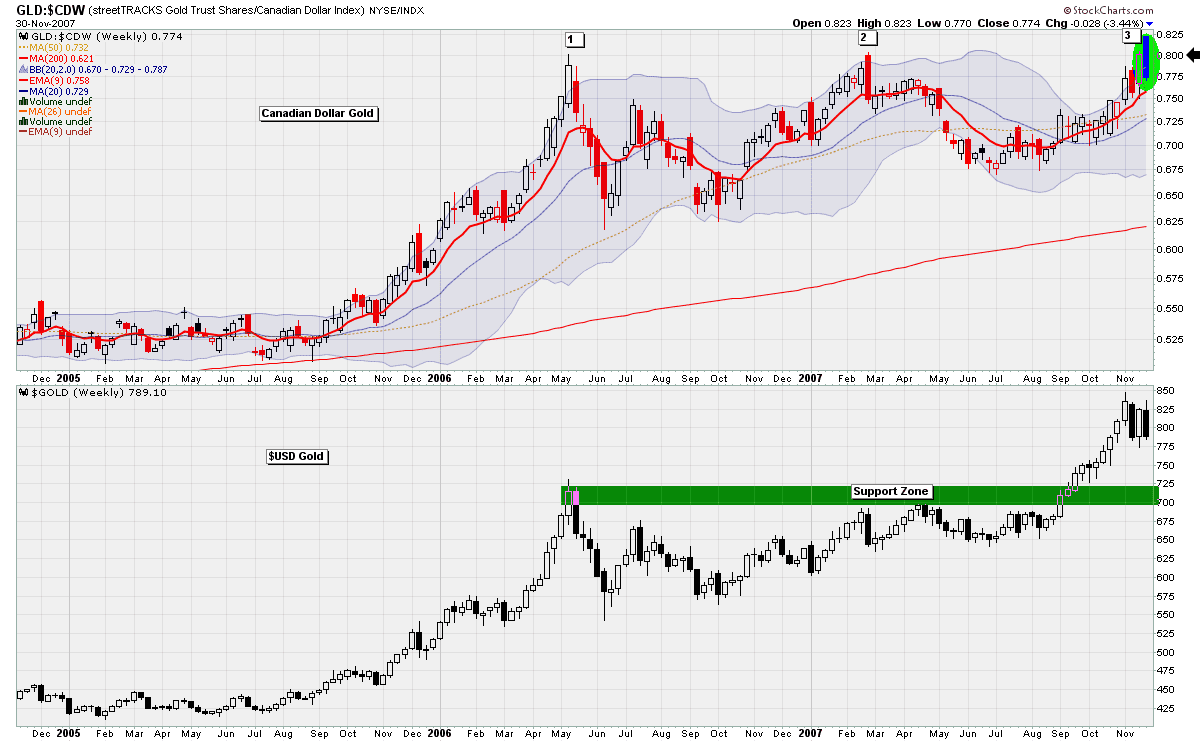
In last week's post, I suggested that gold priced in Canadian Dollars was testing a key level of resistance. Last week's price action has proven that it has failed quite miserably at this test. The chart below illustrates this point.


The candlestick formation that formed at this level of resistance is also noteworthy. The combination is what is known as a dark cloud cover. Steve Nison, author of Japanese Candlestick Charting Techniques, says the following about this pattern:

The rationale behind this bearish pattern is readily explained. The market is in an uptrend. A strong white candlestick is followed by a gap higher on the next session's opening. Thus far, the bulls are in complete control. But then no continuation of the rally occurs! In fact, the market closes at or near the lows of the day moving well within the prior day's real body. In such a scenario, the longs will have second thoughts about their position.


But it is not only Canadian Gold that has failed at a key area of resistance, but Crude Oil too. I showed this following chart several posts ago, but I thought it would be good to have an update on the oil situation:


This chart shows a weekly perspective on the Oil ETF, USO. In my opinion, the price has been struggling at the resistance area highlighted. Furthermore, the chart put in a large red candle for this week, with no lower shadow, on decent volume. There is nothing bullish about that sort of combination.

In Friday's edition of John Murphy's Market Message, John Murphy pointed out that the CRB and GSCI commodity indexes were also at resistance. This makes sense, since these indexes are heavily weighted in crude oil.

Finally, let's have a look at a daily chart of the US Dollar:


Ever since the US Dollar broke through the key support area of 80, it has been getting creamed very badly. However, it seems that the US Dollar bears may take a bit of break for the next couple of weeks as shown by some of the bullish developments in the above chart.

Firstly, the USD put in a dragonfly doji right on the 75 mark. The fact that the bulls were able to defeat the bears at this level is encouraging. In addition, the MACD Histogram has given us a buy signal for the first time in months. If the US Dollar begins to rally, it will certainly bring commodity prices down. If you agree or disagree with this analysis please leave a comment. Thanks for visiting.

For additional analysis, I recommend the following 2 blogs:

Canadian Point and Figures
Headline Charts