Saturday, December 22, 2007

From Bearish to Neutral

Gold stocks started the week continuing last week's bearish momentum, but that momentum was lost toward the end of the week. Both Canadian and American gold stocks are retesting the breakdown point that occurred on Monday. This chart, showing Canadian Gold stocks, shows what I mean:


The above chart is a daily chart of an ETF that does twice the performance of the Canadian Gold Stocks Index, and the ticker symbol is HGU.to. As you can see, there was a quadruple bottom breakdown that occurred on Monday, which seemed to me to be quite bearish at the time. Although gold stock rebounded sharply on Friday, this gap area is going to be resistance, in my opinion.

The next chart is a daily chart of GLD. Obviously, there is a triangle forming, and many analysts see this as a bullish development, and that is a definite possibility. My advice for trading this is do not jump the gun on this formation. Gold and gold stocks are notorious for failed breakouts.


My options expired yesterday, so I probably won't be looking at the charts all that much next week, and I am sure most people have better things to do at this time of year than to technically analyze gold stocks! Hope everyone has a good Christmas.

Monday, December 17, 2007

Bad News for Gold Stocks

Everyday I examine 81 charts which are related to the gold market. Besides the 3 posted already, here are 2 more charts that caught my eye this week. First we have a daily chart of GDX:


I mentioned in another post that I thought gold stocks were forming a bearish head and shoulders pattern. This pattern is becoming more mature, and, in my view, has been activated. The downside target is what is labeled "Target 1" in the above chart.

Target 2 refers to the unfilled gap left from the beginning of September. I think that GDX would not descend past this area of support.

The next chart shows a weekly chart of GDX:


The main point of focus should be on the large red candle that occurred on heavy volume last week. There is absolutely nothing bullish about that candle. This is another reason that gold stocks look bad right now.

Sunday, December 16, 2007

Technical Analysis of Currencies

Many interesting developments occurred for this past week, so this week's posts will be more in depth than usual. Let's start off by looking at the Euro versus US Dollar. This currency pair broke down quite badly this week. In fact, the Euro did not experience this level of selling in one day since 2004. Here is a point and figure chart that outlines the damage:


This chart has 0.5 box size and a 3 point reversal. It goes back until the end of July 2007. As you can see in the above chart, the Euro has formed a triple bottom sell signal, which, of course, is very bearish. This shows that the bulls have lost a key battle at an important support zone, and that the bears are now in control.

The above chart also shows a triple top buy signal that occurred back in September. Because this pattern is the opposite of the pattern just mentioned above, you may want to check out this article.


A defeat for the Euro must mean a victory for the US Dollar, and the following daily chart shows that was in fact the case:


If you observe the above chart, you will see that the bulls are in control of the US Dollar right now. This is evidenced by the extremely tall white candle formed on Friday, and by the MACD Histogram, which is showing that the short term trend is up.

On the November 17th post, I suggested that US Dollar strength was in the pipeline. On December 1st, I showed that the US Dollar Index was putting in some bullish candles, and that the bulls won a battle at the 75 mark. It would be worth checking out these posts, since the lessons learned will inevitably be applicable to some market situation at some point in the future.

Here is final chart showing another perspective of the US Dollar. It is a weekly chart, and the indicator on the bottom is the ADX indicator:


I showed a similar chart using the ADX Indicator in this article. However, my predictions turned out to be totally wrong, and the indicator gave a false signal. One would think that after this failure, I would be dubious of using this indicator again, but the difference here is that the above chart is a weekly chart, and not a daily.

The way signals are generated is when the thin blue line crosses above 35. This indicates that the trend is near exhaustion, and that a period of rest is needed. I feel that this method of using this technical indicator is more reliable than the daily version.

There will be another post to come later on today. Thanks for visiting.

Tuesday, December 11, 2007

Two Charts of the TSX

We all know what happened today, so I won't go into the details. In this post I'll just show two charts that may give you a perspective not shown in other sites. Firstly, we have a daily a chart of the TSX:


You'll have to click on the chart to read the annotations. The main thing is that the TSX failed at the confluence of two sources of resistance, and that the candlestick put in today is bearish.

Now, let's have a look at an intra-day chart of what unfolded. In this chart, each candle represents 5 minutes of price action and it covers three days.


Also worth mentioning is that every sector was hit today, and gold stocks did not escape the carnage today. Gold stocks are at a very important juncture as suggested in the last post. A defensive viewpoint is definitely warranted at this time. Thanks for visiting.

Sunday, December 9, 2007

GDX, The HUI, and Barrick Gold

Gold was up marginally this week, and North American gold stocks were more or less unchanged. Gold stocks have been treading water for a while now, but probably not for much longer, as this post will show.

First let's have a look at the Gold stocks ETF, GDX. This is a daily chart that covers about 6 months of price action:


The annotations should be self explanatory, so I won't go into too much detail. But one thing I wanted to point out is that the Bollinger Bands are beginning to tighten, which means that volatility is dropping. What often happens is that volatility contractions precede price break outs.

If you observe the above chart you will notice that GDX is sandwiched between solid support and solid resistance. Any breakout from this zone would be a strong buy/sell signal.

Obviously, whether the Fed cuts rates by 25 basis points or 50 basis points will help determine which direction the breakout will be, but let's also look at more charts for additional clues.

What the Bollinger Bands cannot forecast is what direction breakouts will occur in. For that, we must rely on other clues, which are in the next chart. The next chart is also a daily chart, but of the HUI:


This is a similar looking chart, but this chart has additional annotations. In my opinion, a bearish head and shoulders pattern has formed in this chart.

Every week I read dozens of other analysts opinions of the gold stocks market. What I find surprising is that no one else has noticed this pattern, as far as I can tell. I think that the reason for this is because most analysts are bullish on gold, and their minds are screening out anything bearish that appears on the charts.

Even fundamental analysts, like the ones on Bloomberg, are all bearish on the dollar, and bullish on gold. This is definitely an ominous sign for gold bugs. These are the same guys that come out and declare that the gold bull market is over every time there is a correction, like last August.

That being said, the long-term fundamentals for gold and silver are still, like always, intact. For the next ten years, gold and silver will likely outperform every other asset class. Gold stocks will likely do well too. In fact, here is a long term bullish perspective on one gold stock in particular, Barrick Gold:


The above chart is a weekly chart, and it goes back to around 2002. It is a relative strength chart, that compares ABX to the TSX Composite Index. As you can see, ABX has been under performing the TSX for about 6 years.

What is interesting is that Barrick's relative strength has broken out of its channel, and has started outperforming the TSX. That is certainly bullish for the long term.

By the way, I am experimenting with a new layout for this site. The objective is to make this site look more like a 'real' website rather than a blog. If you prefer the old look, please write a comment.

Thursday, December 6, 2007

A Quick Look at Kinross Gold

This is a chart that caught my eye today, so I thought I'd make it apart of a mini post. The following chart is a daily chart of Kinross Gold. You will have to click on the image to get a more legible view.


The main point I wanted to make in the above chart is that Kinross is bouncing off overhead gap resistance at the $18.50 mark. The recent price action also appears to be forming some sort of pennant, which would be bearish if there was a downside breakdown.

In addition, volume appears to be waning, which could be viewed as bearish. These bearish developments would be negated however if Kinross exceeded its recent pivot high point. More to come on Sunday.

Saturday, December 1, 2007

Gold, Crude Oil, and the US Dollar

For this past week, gold lost $35.60, and gold stocks, as measured by GDX, lost 5.10%. In this post, I will show more evidence that commodities and gold stocks are in corrective mode.

In last week's post, I suggested that gold priced in Canadian Dollars was testing a key level of resistance. Last week's price action has proven that it has failed quite miserably at this test. The chart below illustrates this point.


The candlestick formation that formed at this level of resistance is also noteworthy. The combination is what is known as a dark cloud cover. Steve Nison, author of Japanese Candlestick Charting Techniques, says the following about this pattern:

The rationale behind this bearish pattern is readily explained. The market is in an uptrend. A strong white candlestick is followed by a gap higher on the next session's opening. Thus far, the bulls are in complete control. But then no continuation of the rally occurs! In fact, the market closes at or near the lows of the day moving well within the prior day's real body. In such a scenario, the longs will have second thoughts about their position.


But it is not only Canadian Gold that has failed at a key area of resistance, but Crude Oil too. I showed this following chart several posts ago, but I thought it would be good to have an update on the oil situation:


This chart shows a weekly perspective on the Oil ETF, USO. In my opinion, the price has been struggling at the resistance area highlighted. Furthermore, the chart put in a large red candle for this week, with no lower shadow, on decent volume. There is nothing bullish about that sort of combination.

In Friday's edition of John Murphy's Market Message, John Murphy pointed out that the CRB and GSCI commodity indexes were also at resistance. This makes sense, since these indexes are heavily weighted in crude oil.

Finally, let's have a look at a daily chart of the US Dollar:


Ever since the US Dollar broke through the key support area of 80, it has been getting creamed very badly. However, it seems that the US Dollar bears may take a bit of break for the next couple of weeks as shown by some of the bullish developments in the above chart.

Firstly, the USD put in a dragonfly doji right on the 75 mark. The fact that the bulls were able to defeat the bears at this level is encouraging. In addition, the MACD Histogram has given us a buy signal for the first time in months. If the US Dollar begins to rally, it will certainly bring commodity prices down. If you agree or disagree with this analysis please leave a comment. Thanks for visiting.

For additional analysis, I recommend the following 2 blogs:

Canadian Point and Figures
Headline Charts


Sunday, November 25, 2007

Looking at Gold Through Another Lens -Part 2

Because gold is basically the US Dollar's nemesis, and vice versa, I thought I would show this relationship another way. To do this, I looked at the inverse of the US Dollar. The excellent website, Stockcharts.com, allows you to invert the price of any stock by taking the symbol '$one', and dividing it by the stock. Here is a chart that uses this technique:


The chart itself actually shows the price of gold, but we have the RSI of the inverted US Dollar on the top instead. The areas highlighted indicate the times where there is additional risk involved in holding gold. I feel that 5 out of the 6 signals given were fairly reliable. (By the way, I still feel that the US Dollar is in the process of bottoming short term).

Some of the past charts were a bit on the complicated side, which I am not sure is good or not. In any case, here is some traditional technical analysis on the Gold Stocks ETF, GDX:


This chart utilizes an easy to use moving average crossover system. Whenever the 9 day EMA crosses over the 20 day SMA, a buy signal is triggered and vice versa. This chart also shows a trend line that has just been broken.

Recently there has also been a bearish moving average crossover. I think I will stay bearish for as long these lines stay crossed. If they cross back, then most of the analysis I have done in the last few posts will be proven incorrect, and a loss will have to be taken, but that is the cost of doing business.

A moving average cross back is one possible scenario. Another possibility is that there will be another wave of selling, which would be a B wave for Elliott Wave folks out there. This would also complete a complex head and shoulders pattern that appears to be forming. I feel that both situations are possible, but that the latter is more likely.

The next chart is not directly related to gold, but involves the TSX. On the top panel we have the Japanese Yen divided by the Australian Dollar. On the bottom we have the TSX. I showed this relationship before, but this chart is a much longer term perspective. In fact, this chart goes back to the end of 2002, which is where the TSX bull market began.


I think a lot of people feel the bull market in stocks worldwide over the past 5 years has at least partially to do with the Yen Carry Trade. I do not think that the fact that these 2 charts are almost perfect mirror images of each other is a coincidence. What I find slightly worrisome is that the carry trade barometer in blue has, for the first time, not made a lower low. This could mean the carry trade is starting to dry up, and, if that is the case, it would not be beneficial to the TSX.

Saturday, November 24, 2007

Looking at Gold Through Another Lens -Part 1

For this past week, gold bullion rose by $37.70 or 4.79%, and gold stocks, as expressed by GDX, increased by 4.05%. There were some unusual developments this week as well. For example, the US Dollar and the Canadian Dollar fell simultaneously, which very rarely happens. Also the TSX ended lower for the week despite a bounce back in commodity prices.

The fact that the Canadian dollar fell while gold rose finally gave some relief to Canadian holders of precious metals, which brings us to the first chart. The following chart shows the price of gold denominated in Canadian Dollars on the top, and Canadian gold stocks on the bottom:


It seems that very few technical analysts look at the price of gold in Canadian dollar terms. This is unfortunate, since most of the companies inside the major gold indexes are Canadian. If you look at some of the companies inside GDX, you will find names such as Barrick Gold, GoldCorp, Kinross, Agnico Eagle, and Yamana, and these are all headquartered in Canada.

This means that these company's profitability will be directly affected by gold's price in Canadian dollars. Anyway, if you examine the above chart, you will notice that Canadian gold is at what could potentially be triple top resistance.

This resistance is also round number resistance. This is because the resistance area has formed where Canadian gold has reached the $800.00 mark. Looking at it another way, gold in Canadian Dollar terms is at the same level that it was back in May 2006.

If Canadian gold fails at this level, it will have ramifications for both Canadian and American gold investments.

Saturday, November 17, 2007

Intermarket Analysis of the US Dollar

For this past week, gold was down $47.70, and gold stocks, as measured by GDX, were down by 6.68%. As well, the resource laden TSX Composite Index dropped another 340 points this week.

This post will provide additional evidence to show that commodities are in correction mode. Let's first have a look at silver. Here is a daily chart of silver going back to February 2006:


What I find significant about the above chart is that silver has just formed a bearish double top formation with its old May 2006 high. The well known technical analyst of the 1920's, WD Gann, stated that if the distance between the tops of a double top formation are far apart, the bearishness of the pattern is increased. I therefore feel this event is a major negative for silver.

Also in the above chart I have highlighted the major volume spikes that have occurred for this ETF. These volume spikes encapsulate the fear and greed present in the market, and show when there has been climactic buying and selling.

Finally, if you look very carefully at the above chart, you will see that the Silver ETF has just formed a bearish island top formation. I have enlarged this pattern in the image below:

In my view, islands represent major shifts in psychology in the market. In this case, the shift was from bullish to bearish. The above image shows that silver was demolished on Monday, and although not shown, this price action occurred on heavy volume. Obviously, this is a bearish combination.

This next chart shows a daily chart of the US Dollar on the top panel. On the bottom panel, we have an MACD histogram of the ratio of US Stocks divided by International stocks.

This indicator can help detect strength and weakness in the US Dollar. The rationale behind it is that when investors feel that the US Dollar is going to start strengthening, they will be more inclined to pull some of their money out of international stocks, and reposition themselves in American stocks, to take advantage of dollar strength.

Everything else being equal, investors would rather be invested in stocks where the local currency is rising. This means that movements in this ratio, which are translated into movements in the MACD below, usually show when US Dollar strength is in the pipeline.

I have highlighted the areas where the intermarket picture was hinting at US Dollar strength. I think that 5 out of the 6 signals were fairly accurate. What is important to note is that we are very close to getting another signal.

If the US Dollar finally finds some strength in the coming weeks, it will add negative pressure to commodities.

Also worth mentioning this week is that Gold put in a large red candle this week, and the TSX is clearly in a downtrend. I would definitely like to see a positive moving average cross over before going long again.

So, all in all, at this time, I feel that gold, silver, and the TSX are in a corrective mode, and I did not see any evidence in the charts to indicate a reversal at this time.

For additional analysis of the TSX and Commodities, I highly recommend the following blog. Thanks for visiting.

Sunday, November 11, 2007

A Bearish Perspective on Commodities

For this past week, gold bullion tacked on another $26.20 and silver rose by 95 cents. This, however, was not enough to keep gold stocks afloat, as GDX fell .79% for the week. So, resource stocks are doing much worse than the price of the resources themselves. This is further evidenced by the fact that the TSX fell nearly 500 points this week on rising commodity prices.

This post will present further evidence to support a bearish viewpoint. The charts presented in the last two posts are still in play, and this post is meant to supplement this view. Let's get right to it by looking at a weekly chart of the XAU:


In the chart above, each candle represents one week of price action. Last week's candle is in the form of a shooting star. This means that the bulls pushed prices up intra-week, but then the bears stepped in and wrestled control away from the bulls, and closed the price near the week's opening price.

The chart above shows two other times this pattern happened. Now, I outlined this same candle pattern a couple of posts ago, and, although prices did retreat after this candle was formed, prices bounced back up again afterwards. The main difference between then and now is that the above chart is a weekly chart, and candle formations here tend to be more reliable.

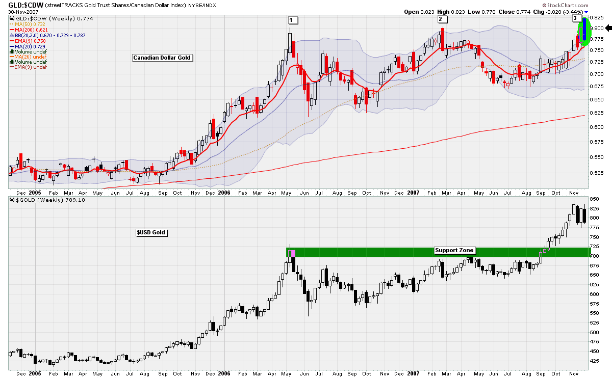
The next chart is a weekly chart of the Canadian Dollar. Because the CAD is a commodity currency, if it begins falling, you know that gold and oil are likely falling too. Interestingly, the CAD is more overbought now than it ever has been in its existence. The chart below uses a 25 week RSI, which means that prices really have to move to register a signal.


Another point in the above chart is that the Canadian Dollar's advance seems to have been split into two waves, and currently both these waves cover the same amount of ground. That in on itself is not particularly bearish, but it is worth pointing out.

Like the weekly XAU Chart, the CAD chart also formed a bearish shooting star formation. The chart below presents an enlarged view. You can also see that the 9 week RSI has reached an extreme level:


Several posts ago, I showed a chart that divided the Yen by the Australian Dollar to get an idea on how nervous carry traders were feeling. If you have not read that article I would recommend that you do, because I think it explains last week's TSX sell off. Here is an update on that chart:


I know that the above chart looks quite busy, but there is a lot of value in it, in my opinion. The main thing to note is that the carry trade index in the top panel trends in the opposite direction of the TSX in the bottom panel.

What concerns me now is that the carry trade barometer is forming a potential triple bottom. If the Yen continues to appreciate relative to higher yielding currencies, it will squeeze out a tremendous amount of money from stock markets worldwide, including the TSX.

I have never released this next chart before. This chart shows a daily chart of the TSX on the top, and a new indicator on the bottom. This is related to an indicator called the McClellan Oscillator.

In a nutshell, what it does is take 2 moving averages of an index's Advance Decline line, and determines the distance between these 2 lines. In other words, it measures stock market breadth.


Unfortunately, Stockcharts.com does not have this indicator for the TSX, so I had to make up my own. In the chart above, I have highlighted only the areas where the signal line is below zero. These periods indicate times where there is additional risk involved in being invested in the TSX. The main point is that the line has just last week plunged below the zero line.

In this post, I have tried to look at the markets in several unique perspectives, using daily and weekly time frames. I hope it made sense. Thanks for visiting.

Saturday, November 3, 2007

Resource Stocks are at Resistance

For this past week, gold bullion increased in price by $21.00, or 2.67%. However, and this is amazing, gold denominated in Canadian Dollars actually fell. This week, the Canadian Dollar rose relative to the US Dollar by 3.03%, so that means the Canadian gold holders lost .36%.

In this post, there will be quite a few charts. Since in the previous post, we had a look at oil, let's see how oil stocks are doing, to start things off. The daily chart below is of an ETF that contains a basket of Canadian energy stocks. (The ticker symbol is XEG.to. There is another ETF that will allow you to short this index by a factor of 2. Its ticker symbol is HED.to.)


The yellow area is simply showing that this ETF is coming against some gap resistance. The next chart shows the TSX Composite Index. This index is highly oil driven, so it is not surprising to see this index bumping into some overhead resistance as well.


In the TSX chart above, I've also outlined some volume patterns. The next chart is a daily candle chart of XGD, the Canadian gold stocks ETF. There are a couple of things to note here. Firstly there is gap resistance as well in this chart, and there is another layer of resistance that stems from the previous high formed in April.


Furthermore, in the above XGD chart above, you can see that there is a large divergence forming on the Relative Strength technical indicator. Finally, I made a comment on the chart saying that this ETF has not been as strong as, say, GDX. This is because the Canadian Dollar is rising so rapidly.

The chart below shows the daily price action of gold stocks, as measured by the XAU, divided by the gold, as measured by GLD. In a healthy uptrend, we want to see gold stocks outperforming the actual metal. For the last month or so, this has not been happening.


In addition, there is a RSI price divergence apparent on this chart. And if you use your imagination, there is a head and shoulders pattern forming over the last 6 weeks.

So, overall, I feel that at this time there is a confluence of negative factors working against gold stocks. Gold has basically risen 12 weeks in a row, and no market, no matter how strong the fundamentals, can go up in a straight line.

Long term holders of precious metals can definitely ride this out, however. I feel that gold will be at over $1000.00 an ounce this time next year, and the USD Index could eventually go into the 40's, but it will never get there in one straight line.

Thursday, November 1, 2007

A Technical Look at the Price of Crude Oil

The price of oil has been in the news as of late, so I thought I would throw a chart up showing the weekly price action of it. The chart below is actually of an ETF that tracks the price of oil. The ticker symbol is USO, whereas the ticker symbol of oil itself is $WTIC.

This chart contains a lot of information, so it may take some time to make sense of it. I would recommend clicking on the image for a larger view.


This chart utilizes the new indicator I mentioned in the previous post. I have outlined the overbought territory in red, and the oversold area in green. The accuracy of this indicator is enhanced when used in conjunction with the RSI. Besides that, the annotations are fairly self explanatory.

The other aspect that you may have noticed is that this Exchange Traded Fund is nearing a potential double top. This combined with the fact that the RSI and that the new indicator are both overbought as well, is not a bullish combination.

Now, I am very bullish on oil in the medium and long-term, but, that being said, I do think that prices may have gotten ahead of themselves, and a short-term correction may be due. I also think that the price of oil itself will certainly find round number resistance at the $100 dollar per barrel area, which it is near currently.

Like always, I have no way of predicting the future, but I hope that, at the very least, analysis such as this, can help put the odds in our favour. Thanks for visiting.

Wednesday, October 31, 2007

A New Index and a New Indicator

When analyzing gold stocks, I try to look at as many indexes as possible. Some indexes that I watch are the HUI, the XAU, GDX, and XGD.to. The advantage of this is that occasionally one of these indexes will give a heads up not provided by another index.

An example of this happened on Monday, where XGD formed a text-book shooting star, while GDX closed very strongly that day. GDX gapped down on Tuesday, and closed about 2% lower that day.

I was browsing StockCharts.com's public chart list the other day. One of the lists that I appreciate there is from a man named Robert Cote. He had an interesting chart of index that I was previously unfamiliar with called the Dow Jones United States Precious Metals Index. The ticker symbol for this index is $DJUSPM. Below is a weekly chart of it:


Notice that, as shown by the yellow rectangle drawn, that resistance turned into support, and that support later flipped to resistance again. (For anybody interested in drawing semi-transparent zones when annotating charts, you press the CTRL botton on your keyboard while drawing shapes. It took me 6 months to figure this out.)

Anyway, beneath the candle chart is a new indicator. I attempted to explain the mathematics behind this indicator here. In a nutshell, it simply tells you how far, on a percentage basis, the price of a security is from its 50 period moving average.

In general, stocks tend to regress toward the mean, and when prices become very distant from the 50 period moving average, it indicates that there is risk in holding that stock. In the above chart, when the index becomes 30% higher than the 50 week moving average, that seems to show that prices have gone up too far too fast, and a correction is due.

What I like about this indicator is that it can give you overbought and oversold readings, similar to the RSI, but the mathematics behind it are completely different from the RSI. Therefore, if the RSI were to confirm this new indicator, that would be a more powerful signal than say the RSI confirming a Stochastics signal.

By the way, if you scroll down, you will find a box to enter in your email address. By doing so, you can receive an email notification whenever there is a new post to this site. Since I do not post on a regular basis, this can save time by avoiding continually checking in to see if there is any new material. Thanks for visiting.

Saturday, October 27, 2007

Is Gold Increasing in Value?

This week, the price of gold was up by just under $20.00 an ounce, and gold stocks, as measured by GDX increased by 3.42%. My gold stocks short position gave back all the profits made last week, but I will continue to hold these positions, as long as they do not exceed their October 15th high.

With gold rising so quickly, you may think that it would be insane to short gold stocks, but then again, is gold really rising? I feel that much of the yellow metal's recent rise can be attributed to a falling dollar and not to rising gold. In other words, an ounce of gold is worth more dollars, but those dollars are, in turn, decreasing in value by a similar rate.

This is evidenced when looking at the value of gold in a currency that is not currently being debased, such as the Canadian Dollar. The chart on the bottom shows that Canadians holding physical precious metals, such as myself, have not made money in the last 2 months.


Although holders of gold have not seen impressive profits when denominated in currencies other than the US Dollar in last couple months, this has not been the norm since the gold bull market began. The trend for gold is up overall in all currencies when looking at the long term picture, as illustrated in the following chart.


As you can see, Gold has done quite well when denominated in several major world currencies over the long run. This is shows that the bull market in gold is healthy and that gold in real terms certainly is rising.

Furthermore, in addition to trading gold stocks, I feel that one should allocate some money in a core position of physical gold or silver, and to hold that position regardless of what the charts tell you. In a bull market, the best strategy is a buy and hold strategy.

Saturday, October 20, 2007

The Yen, the Australian Dollar, and Stocks

As you probably know, stock markets world wide experienced significant corrections yesterday. Many people blame this on the 20th anniversary of the 1987 stock market crash, but I think that it was quite clear that a correction was coming, no matter what the reason behind it.

In the last post, I said that gold stocks were looking weak, and right now I still feel that they are looking weak. Some of this weakness has to do with the fact that equities in general are declining, and gold stocks, being stocks, will continue to fall as the markets fall, as Paul mentioned in a comment in the previous post.

When times get tough, it is certainly better to be in the metal rather than in gold stocks. You know, gold actually rose about 11 dollars this week, and paradoxically, my short gold stocks position made over 5% this week.

Anyway, let's have a look at some of the intermarket forces at work that may be driving global stock market weakness.

The following chart shows the Japanese Yen divided by the Australian Dollar. This relationship helps illustrate the health of what is called the carry trade. This refers to when traders borrow Yen at low interest rates, and convert it into a higher yielding currency in order to make profits.

Some traders go a step further and invest the higher yielding currency into the stock market for additional profit potential. An example of this would be a trader borrowing Yen at a rate of interest of 0.5% and buying Australian Dollars, which yields 6.5%, for an easy 6% profit. The trader then may invest the money in Australian stocks.

Since the trader borrowed Yen he will have to pay it back. If the Yen remains flat or decreases, the trader will hold his position. However. if the Yen starts appreciating rapidly, the trader will be inclined to sell his Australian stocks, take his dollars, and convert them back into Yen, before it appreciates anymore.


The above chart shows the TSX in red, which is similar to the Australian Stock market, and as you can see, when the Yen increases relative to the Aussie, the carry trade unwinds, and the TSX plummets. What happens in the TSX is also experienced by other markets world wide.

This fact, that the yen increased sharply this week, is one of the main culprits to the recent stock market decline, in my opinion anyway.

Tuesday, October 16, 2007

Gold Stocks Do Not Look Healthy Right Now

Last week there were two posts made suggesting that the Euro had topped and the US Dollar had bottomed. I still feel this way right now. As a consequence to this, gold stocks may have topped yesterday.

Ever since I turned bearish last week, gold stocks have continued to rise, but they have done so in a fashion not normally associated with a healthy bull market. The daily chart of the GDX, for example, does look worrisome to me. Please refer to the following annotations by clicking on the chart:


In addition, silver is looking weak right now. The following chart is a daily candle chart of SLV, the silver ETF:


Finally, the Australian Dollar, which is a currency very closely linked to the price of gold, looks overextended and ripe for profit taking now. I'll let this daily chart of the currency do the talking however:


So there you have it, three charts, showing three perspectives. I hope that makes sense. If you have any questions or disagreements, please write a comment below. Thanks for stopping by.

Saturday, October 13, 2007

John Murphy's Wisdom

I have been a subscriber of John Murphy's Market Message for a long time. I have an infinite amount of respect for Mr. Murphy, for the books that he has written, and the analysis he conducts.

Recently, video Market Messages have been made available. Here is one such video.

You can subscribe to Murphy's Market Message through StockCharts.com

This blog surely would not exist if it were not for StockCharts.com, and the teachings of John Murphy.

Wednesday, October 10, 2007

Using the ADX Indicator on the US Dollar

Ever since this site was started in June, I have been very bearish on the US Dollar for the long-term. But even though the currency is in a powerful bear market, it still experiences counter-trend bounces, and one of these bounces may now be in the cards.

It is tougher now to pick bottoms in the US Dollar, because it is no longer contained in a descending wedge like it used to be, and the dollar is literally in uncharted territory. In other words, there is no support levels below. But there are other techniques that we can use.

One indicator that is useful in helping determine trend changes is the ADX indicator. This indicator illustrates if a security is trending or not. It does not differentiate between upward trending or downward trending. Here is a daily candlestick chart of the US Dollar Index:


The ADX indicator is shown on the bottom. The line that is most important is the thick red line. I have Stockcharts.com draw a horizontal line at 20 and 40. When the red line crosses over 20, then that indicates that the security is trending quite strongly.

When the red line crosses 40, that tends to indicate that the trend has just about exhausted itself. In the above chart, notice that whenever the ADX is over 40, the USD is close to bottoming out.

Also, in the above chart, the 9 day RSI is not an effective indicator. This ties into the previous post made, and is due to the fact that the RSI does not take into effect the long-term trend of the security. Using 2 Relative Strength Indexes for the US Dollar would be appropriate, in my opinion.

In conclusion, the US Dollar appears to have limited downside left for the short term. In the days ahead, this could put downward pressure on gold and silver. If you have any comments, suggestions, or criticisms please write a comment below, or send an email to DannyMerkel@hotmail.com.

Monday, October 8, 2007

A Chartist's View of the Euro Index

For the Canadians reading this site, I hope that you had an enjoyable Thanksgiving, and for the Americans reading this, my apologies for not posting for a while. The last post that was made was in regards to silver holding support. Here is an update on that chart:


The main thing to note is that when silver descended to the 200 day moving average, it immediately experienced buying pressure. Also notice that the bears cannot close the price in the blue rectangle support area. Please refer to the 2 previous posts for an explanation of this.

However, as each day goes by, I am becoming less and less confident that Silver will continue to hold this support. This is because, behind the scenes, the intermarket picture is beginning to deteriorate.

The Euro appears to me that it is now in correction mode. Whenever the Euro goes into correction mode, it has a negative influence on gold and silver. Here is a daily candle chart of the Euro index:


Last week, while on the subway, I thought of a new technique for using RSI to catch tops and bottoms. I figured that since the Euro is in a major bull market, its RSI will go deeper into overbought territory before registering a sell signal, and, on the other hand, more shallowly into oversold territory before registering a buy signal.

With this in mind, it seemed to make sense to use a less sensitive 14 period RSI for sell signals, and a more sensitive 9 day RSI for buy signals. This is what the above chart does.

In other words, in the above chart, we use the top RSI for sells, and the bottom RSI for buys. And as you can see in the above chart, the Euro has registered a sell signal. Once this occurs, the Euro has a tendency to correct until the point where it reaches a buy signal using the bottom RSI.

In conclusion, this could be viewed as a negative for gold and silver stocks for the next couple of weeks. The long term charts, as always, look excellent though, so I don't expect a significant correction. Thanks for visiting.

Tuesday, October 2, 2007

Silver Holds Strong Support

Today, precious metals investors, including myself, had to endure a bit of pain as gold and silver experienced some profit taking. What is important now is to determine what we can expect from here on in. In my opinion, there was no technical damage to any of the precious metals charts today.

The daily silver chart, for example, is above three layers of support, which, coincidentally, are all in the same area:


The first support level is derived from the blue trend line. This line was resistance until the point that silver gapped above it. This old resistance line now becomes support.

The second support level comes from the 200 day moving average. I know for a fact that many traders place limit buy orders right on this level, which sometimes causes prices to bounce off this psychologically important level.

The third level of support originates from the gap itself. On one of the posts I made on the weekend, I drew a blue rectangle to illustrate that silver would find support in this gap area in the event of a correction.

In summary, therefore, I would say that at this time, the precious metals charts have not broken any major areas of support. If silver continues lower tomorrow, and breaks these levels of support, then I think that would justify taking profits and standing aside until the next wave higher inevitably comes about.

Sunday, September 30, 2007

A Technical Look at Silver Stocks Part 1

The month of September was an incredible one for all gold bugs out there. The XAU gold stocks index increased in value by 19.88% during this month. As well, gold bullion tacked on $69.90 an ounce, increasing 10.51%, and silver, for the first time in a while, rose by a faster pace, increasing in value by 13.81%.

As predicted, the US Dollar broke critical support at 80, and melted down after that point. The US Dollar is so weak that for the first time in 40 years, the Canadian Dollar is worth more than a green back.

With such a large increase over a short period of time, one might think that there is little profit potential out there. I do not believe this. Rather, I feel that this is the beginning of a much larger move. And more specifically, I think that silver has the most potential.

One of the reasons I believe this is because silver has, until recently, been lagging gold. The following chart shows a weekly chart of the SLV/GLD ratio. Basically, when this chart is falling, silver is under performing gold. When it is rising, silver is outperforming gold. The reason I am posting this chart again is because an RSI buy signal has just been triggered:


The other candle chart beneath the ratio represents silver bullion by itself. The two charts are similar, but we can get some additional insight by looking at this perspective. The main thing to take away from the above chart is that silver is "cheap" relative to gold.

Let's have another look at silver. Here is a daily candle chart of SLV, the silver bullion ETF:


The main point to note in the above chart is that SLV gapped up above its 200 day moving average. This is an incredibly bullish sign, in my opinion. In the event of any sort of correction, silver should find support along the blue rectangle drawn.

Finally, let's have a look at this week's commitment of traders chart:


The last time I posted this chart, I said that the commercials had reduced their short position to extremely bullish levels. Now that a few weeks have past since then, the chart is still looking very bullish. The large speculators are only now beginning to "wake up", as their position only this week is larger than the small speculators. The commercials can still increase their shorts by a fair amount before things start looking bearish.

Saturday, September 29, 2007

A Technical Look at Silver Stocks Part 2

If you feel that silver will rise, then probably the best way to capitalize on this opinion is to buy the silver ETF. However, I prefer to hold silver stocks, as there can be more leverage in doing so, and that way I don't have to convert my Canadian Dollars into US Dollars to buy the ETF.

The problem with buying silver stocks is determining which ones to buy. Ideally, there would be a silver stocks ETF, but since there is not, I have tried to find stocks that have a close correlation to movements in the price of the metal.

Two such stocks are Silver Wheaton, and Pan American Silver. I have only selected these stocks because they seem to move along with the price of silver, which is all I'm looking for. Here is a chart showing Silver Wheaton on the top and the price of silver on the bottom:


As you can see, this stock tends to move with the price of silver. Let's have a closer look at Silver Wheaton:


As you can see in the above daily chart of SLW.to, the stock has formed a bullish island reversal pattern, in my opinion anyway. As well, notice that the RSI is not even close to being overbought, which cannot be said for most gold stocks.

However, this does not make this stock immune to a gold correction. Although not shown, the Gold Commitment of Traders chart looks much more bearish than the silver COT chart. Gold stocks can correct at any time now. These type of corrections are very difficult to time.

My plan is to keep holding the aforementioned silver stocks until their 9 day exponential moving average is broken on a closing basis. This method is much less stressful than attempting to get out at the very high of the move. Thanks for visiting this site.

Monday, September 24, 2007

The Bull Flag in the Monthly XAU Chart

The previous post discussed some significant breakouts in the Euro charts, and the post before that showed some major developments in the US Dollar chart. All of this was meant to be indirect bullish evidence in favour of gold and gold stocks. In this post, let's have a look at gold stocks directly.

In order to understand the upcoming chart, I would urge you to read the following two articles:
These articles go over why the long-term gold stocks chart looks so bullish, and the reasoning behind this bullishness. Here is an updated version of the chart mentioned in those articles:


If you do not have time to read the aforementioned articles, here is a summary:

First, a bull flag has formed. Traditional technical analysis suggests that once prices breakout out of the flag, the subsequent rally should be approximately equal the height of the flag pole, which would take the XAU to the 210 area or more, in this case. The XAU has just broken out of the flag.

Second, the bollinger band width has just triggered a buy signal. It has touched the "launch pad" and bounced off. This is another long-term buy signal. You can see for yourself that whenever the bollinger band width reaches the launch pad level, a huge price movement follows.

Third, the indicator at the top, which is not stochastics, but based on volatility, has given a buy signal by crossing over 20.

Finally, the XAU is approaching levels not seen in the history of the index's existence. This can be viewed as a giant bullish triple top breakout. All in all, this all equates to a tremendously bullish situation for gold stocks. This does not necessarily mean that gold stocks will rise tomorrow, but it does mean that they will likely be much higher in the weeks ahead.