Sunday, June 29, 2008

Gold Stocks, Silver, Copper, and the Dow


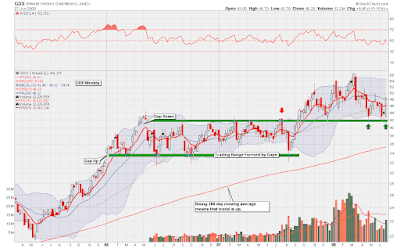
Above is a weekly chart showing GDX, the gold stocks ETF. What I wanted to point out is that gold stocks experienced a very nice bounce off a major area of support. I now feel that the short term trend for gold stocks has moved from neutral to up, so I decided to go long this sector, and will remain long until the short term trend changes.

The next chart is a weekly chart of silver, which also rallied this past week:


Ever since silver corrected from the $21.00 an ounce area, I have been slowly and steadily buying more and more silver coins, which allows me to dollar cost average. In both charts posted so far, I feel that the long term trend is up, so this means that dollar cost averaging is a strategy that has a high probability of paying off. Buying or selling in the direction of the long term trend always puts the odds in your favour.

In addition to feeling bullish on gold stocks and silver, I feel that copper is looking very strong right now. Unlike oil or gold, copper rarely gets any mention in the media, but is something that can make you a lot of money nonetheless.

If copper can decisively break above the $4.00 a pound resistance area, then I think there is the potential for an explosive move higher. In my previous post, I mentioned an ETF that follows the price of copper.

Also in my previous post, the theme that commodities will likely outperform stocks was mentioned. I think that this trend will begin intensifying in the coming weeks. Part of the reason for this belief lies in how ugly the Dow Jones charts look (monthly, weekly, or daily.)


The above chart shows the Japanese Yen on the top panel and the Dow Jones Industrial Average on the bottom panel. For the last month, I thought that the Yen would start rallying and this would take stocks down. However, for the most part, the Yen has fallen along with the Dow. The way I see this is that if the Dow can't even rally with the help of a falling Yen, then we are in serious trouble when the Yen eventually does turn around.

If the Yen begins rallying, it will start unwinding the so called carry trade, and cause stocks to plummet. The Yen appears to be bouncing now off its 200 day moving average, so this is a chart I will keep my eye on next week, as things may get very interesting.

Thursday, June 19, 2008

Real Versus Nominal Stock Market Returns

Because the price of gold seems to be going through what is known as the summer doldrums, which is basically a period where there is no trend and a time where it can be more difficult to make profitable trades, I have decided to focus this post on another topic for the meantime.

What I will try to illustrate here is the effects of excessive money printing and inflation on real stock market returns over the past 10 years.

The chart below shows the S&P 500 divided by the price of gold:

One wonderful characteristic of gold is that it is able to sniff out the effects of excessive money supply growth. The amounts of money the government is printing is sometimes also known as M3, and M3 is a statistic the US Government fairly recently stopped calculating.

Although we no longer have M3, gold is just as able to detect money supply growth. This is because as the government prints (either physically or digitally) increasing amounts of money, that paper will start chasing only a finite amount of gold, and, thus, gold will rise.

Therefore, the above chart shows what I would say is the real value of the S&P 500 if the effects of money supply growth are stripped away. In other words, the bull market in stocks that began in around 2003 was not real. It was an illusion.

But why was the money supply increased so dramatically over the last couple of years? I think it was a way for the Federal Reserve to try to reinflate the stock market bubble that burst in 2000. Unfortunately, rather than reinflating stock prices, this newly printed money found its way into the housing sector, and began pumping up another bubble. Now that the housing bubble has popped, the money supply is again being increased to reinflate this bubble, but rather than reinflating home prices, it is inflating commodity prices now.

The next chart shows an ETF that follows the S&P divided by the price of crude oil over the last 10 years:


I feel that the above chart is dramatic proof that the S&P has not been rising in value in real terms. In other words, an 8% per year "growth" rate in the S&P 500 over the last several years is useless if everything you need to live on is rising by 25% a year.

Another example is to look at the S&P 500 against the CRB Index. What I like about the CRB index is that it measures a basket of items that an ordinary person would use on a daily basis. Items such as: gasoline, natural gas, corn, wheat, cotton, live cattle (beef), coffee, orange juice, and sugar.

As you can see, the stock market has not been successful at keeping up with the cost of even everyday necessities.

If investing in stock cannot protect against the ravages of inflation and excessive money printing, then what should the ordinary investor do? I think the best answer is to invest in the commodities themselves. In this type of environment, I personally try to invest in tangibles that cannot be created readily (like paper money can). Here are some ideas:

1) Physical gold, silver, platinum, or palladium
2) ETFs that invest in hard commodities:
  • GLD for gold
  • SLV for silver
  • JJC for copper
  • JJN for nickel
  • USO for crude oil
  • UNG for natural gas
  • DBA for agriculture
  • COW for livestock
  • RJA for a mixture of all of the above

Sunday, June 15, 2008

The US Dollar, Agriculture Charts, and New ETFs


The above chart is a daily chart of the US Dollar Index. As you can see, the Dollar recently broke out of a bullish triangle formation and is now trending up. This fact has put downward pressure on both gold and silver, and I think there is a good chance that this will continue happening for at least the short term.

One commodity that is catching my eye, and does not seem to have been affected by dollar strength is agriculture. Like oil and gold, the fundamentals for grains appear very strong right now. I can't go into all the reasons why here, but I will at least show a chart of this sector:


The above chart shows an index that combines the price of soybeans, corn, and wheat. The main points are that the trend is up, which is key, and also that a bullish breakout has just occurred.

There are several ETFs that more or less track this index. I have purchased one that trades on the TSX, and the ticker is HAU.to. What is interesting about this particular ETF is that it does twice the daily performance of the underlying index. There are other ETFs that track this index. Two tickers that I know are DBA, and JJG.

Finally, here is a longer term chart of the same chart posted above. It goes back about 15 years:


In my view, grain prices have been falling for decades, and are only now emerging from a deep bear market. Unlike gold or oil, which I would say are in perhaps the third inning of a major bull market, grains seem to be entering the first inning of a major long term bull market.

Along with silver, gold, and copper, this is one commodity I plan on holding for at least the next ten years.

Saturday, June 7, 2008

The Carry Trade, The TSX, and Oil Stocks

If yesterday's market activity could not compel me to write for this blog, then I don't think anything would. Besides the obvious headlines you have probably already read regarding Crude Oil and the Dow Jones, there are many other interesting developments that I feel are going on behind the scenes that are just as significant.

In the previous post that I wrote, I mentioned that the VIX was bouncing off support, and that this would negatively affect the TSX. So far, the VIX has bounced quite strongly, but this has not yet had a major effect on the index, although I think it will shortly.

Another theme that I touched on was the relationship between the TSX and the Japanese Yen. Here is an update of the same chart I posted last time:


As you can see, the Yen is still holding support. I feel that if the Yen bounces of this support area, it will negatively affect the TSX.

To look at this relationship at another angle, I sometimes like to look at the Yen/Euro cross versus the TSX. This is what this next chart does:


Hopefully, if you glance at the above chart, you will see a mirror image, even though the two charts are measuring completely different markets. What we have is the Yen/Euro cross on the top panel, and the TSX on the bottom panel. If you are unfamiliar with the rationale of the above chart, I would recommend checking out this article.

While I was on holidays, I spent quite a bit of time trying to develop new techniques for analyzing the markets. One technique that I developed came to me while I was reading an article from HeadlineCharts:

What we have in the above chart is another candle chart of the TSX, and a ten day moving average of the inverted put/call ratio as a solid line layered on top. I realize that the put/call ratio is not measuring option activity for the TSX, but, nonetheless, there seems to be a reasonably tight correlation between the two.

The way this chart would work is to look for divergences between the two graphs. It seems that there is bearish divergence building for the TSX presently.

The only sector keeping the TSX afloat right now is the energy sector. But, like an engine running one just a few cylinders, a market deriving strength on just a few sectors is likely to stall. What I found bizarre yesterday was how poorly energy stocks did considering how strongly crude oil rose.

In the last post, I showed a chart of stock that had caught my eye, Petro Canada. Here is an update on that chart:


The above chart shows Petro Canada, ticker symbol PCZ on the NYSE. I felt that this stock made an extremely rare and bearish candle formation as outlined in my previous post. What I find interesting now is that yet another shooting star was put in on Friday. Furthermore, I find it bearish that this stock was only able to rally by 3 cents a share while crude oil rose by more than ten dollars a barrel yesterday.

Basically, I feel extremely bullish on crude oil for the long term. I have read about half a dozen books on the subject of peak oil, and fully believe the arguments that are made. However, as a technical analyst, I feel bearish on oil stocks right now for the short term.

Anyway, I know I have not posted much about gold recently. This is because I am not getting any decisive signals on the market, and I don't want to make forecasts just for the sake of making forecasts.

I will continue writing posts every weekend from now on. Thanks to those who wrote comments or emails.