Sunday, September 21, 2008

The Dow is Crashing

The stock and commodities markets obviously experienced a tremendous amount of volatility for this past week. However, what may not seem as obvious is the amount of government intervention/manipulation that went on behind the scenes.

With markets in free fall this week, central banks injected an unfathomable amount of liquidity into the markets. When money is injected into circulation, it is not withdrawn from some sort of reserve (the Federal Reserve does not have any reserves -and is not federal), but is created out of thin air.

One sure way of detecting this type of activity is through monitoring of the price of gold. The amount of gold in circulation is relatively constant, so when the amount of paper dollars in circulation expands, there are more pieces of paper chasing a finite amount of gold, so the price of gold rises.

The past week saw one of the sharpest rallies in gold ever. Therefore, it can only be reasoned that the amount of liquidity dumped into circulation was also one of the largest ever. This increase in liquidity waters down the purchasing power of the US Dollar.

What is interesting is when one looks at how the Dow Industrials performed this week when priced in real money, such as gold, rather than in paper currency. In currency terms, the Dow was only down slightly for the week, but in real money, the Dow has lost a tremendous amount of its purchasing power, due to the fact the the Dow is denominated in dollars that are being watered down:


The markets did rally on Friday, but, in my opinion, this was not due to any change in the fundamentals, but due to changes in regulations socialistically put in place by governments. Not being allowed to short sell banks will not solve anything longer term.

Anyway, now, more than ever, I feel bullish on gold and silver. Here is a long-term chart of the status of this great bull market:


The above chart is a monthly chart of gold, and goes back about 23 years. In my view, the chart shows that we are in a very strong bull market, which, like any trend, is more likely to continue at this point in time than to turn around.

This chart does not necessarily suggest that gold will rise or fall next week or next month. In fact, I have no idea what will happen next week or next month. I feel that it is a more profitable methodology to follow trends rather than try to predict them.

Over the past several several years, I have debated whether if it is more profitable to try to predict trends or simply follow them. This blog has endeavored to try to predict trends, whereas my other blog discusses the wisdom of simply following them.

Through an unbelievable amount of study, I am now fully convinced that the strategy of simply following trends is the superior methodology. As such, I will likely dedicate more effort and time to my other blog from here on in.

Sunday, September 14, 2008

Gold Stocks, US Dollar, and Crude Oil Charts

The above chart is a weekly chart of the XAU gold stocks index. I have said in several previous posts that gold stocks needed to hold the support area outlined above for me to remain bullish on the sector.

During this past week, it appeared that the gold bulls had capitulated, and the bears would close gold stocks well below support. However, towards the end of the week, the bulls miraculously drove the price back above key support, creating the longest lower shadow I have ever seen for the XAU.

In my view this is extremely bullish action, and now, at long last, I am willing to declare that we have likely put in a bottom for gold, and gold stocks.

The next chart is a monthly chart of the US Dollar Index:


When is comes to the USDX, 80 has always been a key support area going back decades. The USD broke support at 80 last year, and plummeted thereafter. Currently the dollar is re-testing this broken support area, which is now resistance. I feel that the USD will likely fail at this level, and head lower, adding more fuel to the gold and silver rebound.

Another development that has occurred that gives me optimism is that crude oil has gone through a healthy correction, and is testing a key level of support as well:

Crude oil is trading within a hair of $100 per barrel, and this number is psychologically significant. This is also the level where crude experienced a breakout, which I mentioned in this post.

I still generally do not recommend trying to pick tops and bottoms, and still feel that trading with the trend is a more profitable methodology. But if you are into picking bottoms, this may be just as good a time as any.


Saturday, September 13, 2008

Manipulation in the Silver Market

Another topic I wanted to bring up was silver and the notion that there is a manipulation in the futures market. I have read and listened to many experts, such as Bill Murphy, who have always stated that the gold and silver markets are manipulated. I felt that this could be true, but at the same time also felt skeptical. However, after witnessing what has happened over the last month with regard to silver prices, I know without question that silver does not operate under a free market.

One way that I became aware of this chicanery was through the realization that, over the past month, every coin shop I went to was completely sold out of silver, which previously was something that I rarely experienced.

A basic understanding of how the law of supply and demand operates will tell you that if a price of a good or service is held artificially low, shortages will appear, as supply and demand are mismatched.

Another interesting development occurs when there is artificial price controls or manipulation in free markets, and that is a black market tends to occur. In a black market, a buyer and seller, through the forces of supply and demand, will reach a price for a good or service that is quite different from the manipulated price.

This is in fact what is happening in the physical market for silver at this time. The price of paper silver, which is traded on the futures exchange, is becoming divorced from the price of physical silver. If you want evidence of this, check out the random Ebay auctions outlined below, and you will see what the real value of silver is.

In this blog I have always advocated physical silver over paper silver, such as ETFs. Because, as I said in the comments in this post, having physical silver is money, and everything else is just paper.


1) 5 ounce NWT bar:
$81.00 plus 15.95 shipping = $19.39 an ounce


2) 30 Canadian 80% silver fifty cent pieces (contains 9 ounces)
$158.49 plus $7.50 shipping x 1.06 exchange rate = $19.56 an ounce


3) 10 ounce JM bar:
$170.00 plus $10.00 shipping x1.06 exchange rate = $19.08 an ounce


4) 20 silver eagles
$345 plus $20.00 shipping x 1.06 exchange rate = $19.34 an ounce


Gold analysis will follow tomorrow.

Saturday, September 6, 2008

Gold, Euro, Natural Gas Analysis


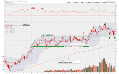
The above chart is a weekly chart of GDX. Despite another round of declining prices, gold stocks are still holing this important support area. In my opinion, this level of support is key, and if it is taken out, I will have a difficult time remaining bullish on the sector.

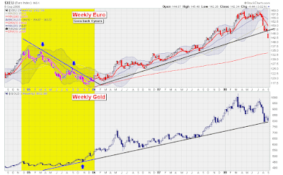
On the other hand, the Euro has broken down badly, and is no longer in a weekly uptrend:


The fact that the Euro has broken down is certainly not an asset to the gold bulls, but it is not necessarily a liability. It is still possible for gold to rally in a falling Euro environment:


Another commodity that caught my eye this week was natural gas. Natural gas prices have collapsed, as this weekly chart shows:


As you can observe in the above chart, natural gas is at a potential level of support, and has formed a bullish candle. Personally, I would not buy this ETF for my trading account, as it would violate my trend trading criteria. However, adding this ETF into a long-term trading account (more than 5 years), such as an RRSP, could be wise.

For my trading account, I was blown out of the positions I mentioned last week. The long positions struggled in the face of the TSX's 1,000 point correction. Whipsaws will always be apart of trend trading, and the only way to avoid them is to stop trading.

As part of my method of managing risk, I always try to go long and short different stocks so that if there is a severe correction, I will be partially protected. Here are some of the positions I took this week and continue to hold:


Saturday, August 30, 2008

Month End Gold and Euro Review

The above chart is a monthly chart of the XAU gold and silver stocks index. This is the same chart I had posted two weeks ago. Since this is a monthly chart, the candle to the extreme right of the chart has now formed, and a new candle will begin forming on Tuesday.

August's monthly candle descended to the upward sloping trend line, and decisively bounced off this level. Furthermore, the price also cleared the horizontal shaded support area, which represents the XAU's previous highs. Both developments are bullish, in my view.

The next chart is a weekly chart of the Euro:

As you can observe, the Euro is testing its upward sloping trend line. At this point, it is holding this level of support, which is bullish for gold and silver. I have no way of telling if this level of support will continue to hold, but for as long as it does, I would count it as a bullish factor for precious metals.

My Renko trend model says that gold's short term trend is neither up nor down. This means that I am unable to take a position until gold decisively moves back up, or fails and continues lower.

In the meantime, I can still indirectly get into the precious metals area by buying Eldorado Gold. This gold stock is on a Renko buy signal, and is showing excellent relative strength against the Canadian gold stocks sector. The following chart shows Eldorado divided by XGD:

Eldorado Gold is one of the only gold stocks that I could find that is still in an uptrend. The fact that this stock was able to hold its ground and withstand the severity of the recent commodity correction is a testament to its strength.


On another note, my stock scanner found another stock to go long this week. The name of the stock is Daylight Resources Trust, and the ticker is DAY/UN.to

As you can probably tell, this stock is in a very powerful bull market. As soon as I bought this stock, it began to appreciate. The reason for this is that when a trend is in motion, it has a tendency to stay in motion. Put another way, at the moment of me purchasing this stock, the probability of it continuing to trend was higher than the probability of it turning around.

In the event that this stock does turn around, which is entirely possible, then I will cut losses once it penetrates the 50 day moving average on a closing basis. Otherwise, it will be held for as long as the trend continues. This strategy allows for potentially unlimited gains, yet limited losses.


Turning back to gold, I feel that the fundamentals are still unbelievably strong, and fundamentally nothing has changed, so therefore I remain bullish long-term on this sector. The video clip below, done by Mike Maloney of GoldSilver.com, is an interview with congressman Ron Paul, and, in my opinion, explains the fundamentals of gold probably better than anybody else:


If the video above is not working, then please click here.

Thursday, August 28, 2008

Jesse Livermore on the Importance of Trends

The following is a quotation from the novel Reminiscences of a Stock Operator, written in 1923 by Edwin Lefevre. This quotation helped reinforce in my mind the importance trading in the direction of the primary move, and to avoid the noise of short-term fluctuations.


His name was Partridge, but they nicknamed him Turkey behind his back, because he was so thick-chested and had a habit of strutting about the various rooms, with the point of his chin resting on his breast. The customers, who were all eager to be shoved and forced into doing things so as to lay the blame for failure on others, used to go to old Partridge and tell him what some friend of a friend of an insider had advised them to do in a certain stock. They would tell him what they had not done with the tip so he would tell them what they ought to do. But whether the tip they had was to buy or to sell, the old chap's answer was always the same.

The customer would finish the tale of his perplexity and then ask: "What do you think I ought to do?" Old Turkey would cock his head to one side, contemplate his fellow customer with a fatherly smile, and finally he would say very impressively, "You know, it's a bull market!" Time and again I heard him say, "Well, this is a bull market, you know!" as though he were giving to you a priceless talisman wrapped up in a million-dollar accident-insurance policy. And of course I did not get his meaning.

One day a fellow named Elmer Harwood rushed into the office, wrote out an order and gave it to the clerk. Then he rushed over to where Mr. Partridge was listening politely to John Fanning's story of the time he overheard Keene give an order to one of his brokers and all that John made was a measly three points on a hundred shares and of course the stock had to go up twenty-four points in three days right after John sold out. 


It was at least the fourth time that John had told him that tale of woe, but old Turkey was smiling as sympathetically as if it was the first time he heard it. Well, Elmer made for the old man and, without a word of apology to John Fanning, told Turkey, "Mr. Partridge, I have just sold my Climax Motors. My people say the market is entitled to a reaction and that I'll be able to buy it back cheaper. So you'd better do likewise. That is, if you've still got yours." Elmer looked suspiciously at the man to whom he had given the original tip to buy. The amateur, or gratuitous, tipster always thinks he owns the receiver of his tip body and soul, even before he knows how the tip is going to turn out. 


"Yes, Mr. Harwood, I still have it. Of course!" said Turkey gratefully. It was nice of Elmer to think of the old chap. "Well, now is the time to take your profit and get in again on the next dip," said Elmer, as if he had just made out the deposit slip for the old man. Failing to perceive enthusiastic gratitude in the beneficiary's face Elmer went on: "I have just sold every share I owned!"

From his voice and manner you would have conservatively estimated it at ten thousand shares. But Mr. Partridge shook his head regretfully and whined, "No! No! I can't do that!" "What?" yelled Elmer. "I simply can't!" said Mr. Partridge. He was in great trouble. "Didn't I give you the tip to buy it?" "You did, Mr. Harwood, and I am very grateful to you. Indeed, I am, sir. But --" "Hold on! Let me talk! And didn't that stock go up seven points in ten days? Didn't it?" "It did, and I am much obliged to you, my dear boy. But I couldn't think of selling that stock." "You couldn't?" asked Elmer, beginning to look doubtful himself. It is a habit with most tip givers to be tip takers. "No, I couldn't." "Why not?" And Elmer drew nearer. "Why, this is a bull market!" The old fellow said it as though he had given a long and detailed explanation. "That's all right," said Elmer, looking angry because of his disappointment. "I know this is a bull market as well as you do. But you'd better slip them that stock of yours and buy it back on the reaction. You might as well reduce the cost to yourself." My dear boy," said old Partridge, in great distress "my dear boy, if I sold that stock now I'd lose my position; and
then where would I be?"

Elmer Harwood threw up his hands, shook his head and walked over to me to get sympathy: "Can you beat it?" he asked me in a stage whisper. "I ask you!" I didn't say anything. So he went on: "I give him a tip on Climax Motors. He buys five hundred shares. He's got seven points' profit and I advise him to get out and buy 'em back on the reaction that's overdue even now. And what does he say when I tell him? He says that if he sells he'll lose his job. What do you know about that?" "I beg your pardon, Mr. Harwood; I didn't say I'd lose my job," cut in old Turkey. "I said I'd lose my position. And when you are as old as I am and you've been through as many booms and panics as I have, you'll know that to lose your position is something nobody can afford; not even John D. Rockefeller. I hope the stock reacts and that you will be able to repurchase your line at a substantial concession, sir. But I myself can only trade in accordance with the experience of many years. I paid a high price for it and I don't feel like throwing away a second tuition fee. But I am as much obliged to you as if I had the money in the bank. It's a bull market, you know." And he
strutted away, leaving Elmer dazed.

What old Mr. Partridge said did not mean much to me until I began to think about my own numerous failures to make as much money as I ought to when I was so right on the general market.

The more I studied the more I realized how wise that old chap was. He had evidently suffered from the same defect in his young days and knew his own human weaknesses. He would not lay himself open to a temptation that experience had taught him was hard to resist and had always proved expensive to him, as it was to me. I think it was a long step forward in my trading education when I realized at last that when old Mr. Partridge kept on telling the other customers, "Well, you know this is a bull market!" he really meant to tell them that the big money was not in the individual fluctuations but in the main movements that is, not in reading the tape but in sizing up the entire market and its trend.

Saturday, August 16, 2008

Gold Stocks Damage Assessment

In this post, I will attempt to analyze the severity of this week's sell off, and contrast it with the sell off we had this time last year.

Much of the weakness we have seen in the gold market comes from a rapidly appreciating US. Dollar:


As the above chart illustrates, the US Dollar has exploded past its 50 day and 200 day moving averages, which is short-term bullish. However, the 200 day moving average is still trending down, which means to me that the long-term trend is down.

I never thought I would say this, but the US Dollar at this point is extremely overbought, after devastating all major worldwide currencies this month. For example, the US Dollar has appreciated against the British Pound for 11 consecutive days in a row. Nonetheless, I still feel that this is a counter-trend rally at this point, as the next chart will hopefully show.

The next chart is a weekly chart of the Euro:


The above chart shows that the Euro is still contained within its long term uptrend, and is now testing its bullish support line. I feel that at this point there has been no long-term damage to this chart, and I will maintain this view for as long as this long-term trend line holds.

It is worth noting that we suffered through a sharp correction in the Euro this time last year. If you want to get some background on this, please read what I wrote this time last year.

Finally, here is a weekly chart of GDX:


Gold stocks continued their short term trend downwards this week, and have descended to an area of strong support. As the above chart shows, this will be the fifth time that GDX has tested this support area. It is essential that GDX holds this area on a weekly closing basis for the long-term trend to remain positive. If you are curious to know how this chart played out this time last year, then please read this post.

For my own personal trading account, I continue to hold my short position, since the short-term trend remains down. I am sensing that my position will not last for much longer, but I will let the price make the decision for me. At the same time, for my long term investment plan, I do plan on doing some serious dollar cost averaging of physical silver at my favourite coin shop this weekend.

Sunday, August 10, 2008

The Bubble is Bursting

For this past week, commodities corrected quite dramatically, which, I am sure, has left many commodity bulls feeling somewhat nervous. If this is the case, I hope that this post will help assuage any doubts.

The first chart is that of the XAU. It is a monthly chart that goes back until 1981:

In my view, the XAU is still in a very powerful bull market. This is evidenced by the fact that over the last 6 years, we can observe a series of higher highs and lower lows. Furthermore, all moving averages are also positively aligned at the moment.

It is often said on financial news stations that gold or commodities are in a bubble. I could not disagree more strongly with this type of statement. One reason for my view is that if you glance at the above chart, you will notice that gold stocks are still at approximately the same level that they were at 25 years ago. I cannot come up with many other asset classes that are in this position.

For a bubble to occur, the general public must become over zealously bullish on a sector. This has not even come close to happening with gold and silver. As an example, the bank I am employed at offers a precious metals mutual fund. This fund fully makes up 0.03% of assets under management. Contrast this number to the prevalence of high-tech holdings seen during the late 1990's.

The next chart also should support gold's case. It shows the Dow Jones divided by the value of the Gold since 1981:


In the early 1980's, the the Dow and an ounce of gold had roughly the same value. During the 1980's the Dow and the price of gold began to deviate, as the Dow rose, and gold fell. This trend continued well into the 1990's, where the pace began to accelerate, ballooning to the point where the Dow could buy over 40 ounces of gold.

This trend lasted for 20 years, and extended 4,000% against the price of gold. However, since the year 2000, this trend has changed directions, and has been deflating remorselessly since then. This is the real bubble that wall street does not mention.

Since I feel that this concept is so important to understand, I have included the opposite perspective of the chart below. It shows gold divided by the Dow:


A few weeks back, I was listening to an interview with investment guru, Peter Schiff. When pressed for an eventual upside target for the price of gold, Schiff said that he thought that the Dow and gold will eventually have the same value. If this is the case, and I believe that it is, then the chart above has a lot more climbing to do.

Anyway, here is a monthly chart of silver:

Silver is in a similar situation to the XAU mentioned above. Obviously, it is in a very strong bull market as well, and this correction is not unlike the corrections we've seen before.

Keep in mind that these charts present a bullish case for gold for the long-term. I am not suggesting that gold will necessarily rise next week. In fact, I have no idea what will happen next week. For the short term, gold has been in a a very clear downtrend, and following the rules outlined in my previous post, I had no choice but to short gold stocks over the last 2 weeks, and I will continue to hold my shorts for as long as the short-term trend persists.

Wednesday, August 6, 2008

Trading Stocks Without Predicting the Future

A few weeks ago, Stockcharts.com introduced Renko charts, and, since that time, I have really developed an appreciation for this charting style. Renko charts, like candle charts, are a Japanese charting style. Renko charts differ in that they do not factor in the passage of time, and, thus, only use price in their construction.

I feel that Renko charts can be used very effectively to determine trends. The chart below is a monthly Renko chart of the Canadian financial sector and goes back three and a half years:


Outlined in the chart above is a buy and sell system that I am using in my own trading. The system has the following rules:

  • Buy signals are generated when the price is in a column of 4 white bricks or more and above the moving average line.
  • Buy signals are removed when your long position moves against you by 4 bricks
  • Sell signals are generated when the price is in a column of 4 dark bricks or more and below the moving average line
  • Sell signals are removed when the short position moves 4 bricks against you

By following these simple rules, the areas shaded yellow you would be long, the areas shaded in orange you would be short, and the area where there is no shading you would be neither long or short.

Although these rules are simple, they allow a trader to gain an edge in that they will allow you to:

  • Buy strength in bull markets
  • Short sell weakness in bear markets
  • Avoid getting involved with weak counter-trend moves (like what we have now in financials)
  • Cut losses short
  • Let winners run
  • Separate emotions from decision making
  • Avoid hours of analysis or try to predict the future

I sense that most traders are hesitant to following such a simple plan, as it is sometimes felt that making money in the market surely must involve more than this. However, after spending thousands of dollars on books, and years of research, there is no question in my mind that any trading method must involve these rules.

Thursday, July 31, 2008

The Wisdom of Peter Schiff

With the last video I posted on this site, I recommended a weekly webcast called the Financial Sense News Hour. One of the advantages of listening to this program is that one can become exposed to the ideas of many different guest speakers.

Peter Schiff is a regular contributor to this internet radio show, and is where I first came across his ideologies. Peter Schiff is a stock broker, money manager, author, and, in my opinion, an expert in his field.

About 1 year ago, I read Schiff's book, Crash Proof. In it, he explains his outlook on the US economy, the housing market, the US dollar, and gold. Looking back now at this book, I am amazed at the clarity of wisdom, and the accuracy of his predictions. Most interesting of all, so far only half of his predications have come to pass, with the other half still in the pipeline, in my view.

Here is a video of Peter Schiff shot in November 2006:

Sunday, July 27, 2008

Trading Gold Corp's Relative Strength

In the previous post, I mentioned the importance of managing risk by hedging. I also talked about how profitable traders tend to buy strength and short sell weakness. One way of following both principles is to buy a company that is showing strong relative strength, and short sell the index.

The following chart shows Gold Corp, symbol G.to, divided by an ETF that tracks the entire gold stocks sector, XGD.to:

The above chart shows how your profit and loss diagram would look like if you had bought shares of Gold Corp and short sold an equal dollar amount of XGD. With this type of strategy, you are not betting if the price of gold will rise or fall, since you could make money either way, so long as Gold Corp continues to outperform the index.

This type of strategy does not involve making forecasts or trying to predict what the future has in store. It only involves following the trend for as long as it lasts, and getting out when the trend ends.

The next charts show XGD by itself. As you can see, it is very choppy, trendless, and difficult to trade at this time:

One difficulty that trend traders sometimes face is that they need to wait for long periods of time before a major trend develops. But by using ratios, hundreds of combinations can be created, and trends can be found.

By trend trading hedges, I feel that I significantly reduce the level of risk, and at the same time, extract money from the hedge by following the trend. Reducing risk is important, especially if you are dealing with Horizon ETFs, since these products are exceptionally volatile.

The chart below shows an ETF a have talked about a few times before, HNU.to. This ETF tracks the price of natural gas, and, as you can see, is one of the riskiest funds out there:


If you had made a $10,000 investment in this fund three weeks ago, it would have dipped to nearly $4,000 in a matter of days. This is why it is essential the manage risk, and cut losses short if the trend moves against you.

Saturday, July 19, 2008

Reducing Risk by Using Hedges

One trait common amongst all successful traders is the ability to manage risk. Experienced traders ask not how much money a trade can potentially make, but how much money a trade could potentially lose. Put another way, not losing money is more important than making money.

When I first started trading, I would usually bet all of my account on a single trade. I have learned (the hard way) that this is not a wise strategy. What I like to do now is go long and short different markets simultaneously in order to reduce risk.

As an example, for the past couple of weeks, I was long gold and short Canadian financials. I did this because the trend for gold was up, and the trend for financials was down. My plan was to hold on to these positions for as long as the trend persisted, which could end up being a day, or a year.

I got blown out of my financials short last Tuesday, but am still holding the gold position. Since I like to have a long and short position on at the same time, I decided to off set some of the risk in my gold position by shorting natural gas. I decided to short natural gas because the trend has turned down.

Being long one commodity and short another substantially reduces risk, but still allows for profit if one of the following three outcomes occur:

1) Gold and natural gas both fall, so long as natural gas falls faster
2) Gold and natural gas both rise, so long as gold rises faster
3) Gold rises and natural gas falls. This is the ideal scenario!

The following chart shows an ETF that tracks gold, GLD, divided by an ETF that tracks natural gas, UNG. If you are long gold and short natural gas, you want this chart to be rising:

As the above ratio chart shows, there are clear times when gold outperforms natural gas, and vice versa. Using this type of ratio charting can help you spot trends that are occurring beneath the surface, which I think allow for an opportunity to profit at a reduced level of risk.

For example, there are times where commodities will correct dramatically, and every commodity will be in the red. If we get one of these days, it probably will not negatively affect my account.

Again, the goal of this position is to remain long gold and short natural gas for as long as the trend persists. If the trend turns around, I will be out.

Wednesday, July 16, 2008

Interview with Oil Expert Matt Simmons

I feel that when someone works hard, does research, and makes a bold forecast that eventually comes to fruition several years later, that person should be given credit. Along with Richard Heinberg, who I mentioned last time, Matt Simmons is one such person.

Matt Simmons, who spent his entire career working with the oil industry, is author of Twilight in the Desert. Simmons also appears frequently in interviews, such as the one done by Bloomberg above, and was featured in the documentary Crude Awakening, which I highly recommend.

Every weekend I listen to a radio broadcast that can be downloaded from the internet called The Financial Sense News Hour. You can download for free the interviews done with Matt Simmons on this show by clicking here and here.

The Financial Sense News Hour piqued my interest as soon as I began listening to it over 3 years ago now. The program is about 4 hours every weekend, and can be downloaded to an iPod or MP3 player.


Sunday, July 13, 2008

Trend Following Using Renko Charts

Over the past year on this site, I have attempted to use technical analysis and intermarket analysis to help better understand the gold market. During this time I think I have made some fairly decent calls, but have also made mistakes along the way. One of the advantages of maintaining this blog is that I can go back and read old posts and see exactly what I was thinking. I can analyze what worked and what didn't.

One common theme of all my money losing trades is that they were made in the opposite of direction of the trend. Having learned from past mistakes and also from reading some excellent books along the way, namely from an author by the name of Michael Covel, I have formulated a series of rules that will prevent counter-trend trades from happening in the future.

The basic premise of trend following is that you want to be buying when prices are going up, and selling when prices are going down. This seems fairy logical, but, unfortunately, most amateur traders instinctively endeavor to do the opposite. Many beginners will stack up as many indicators on a chart as possible, and will start looking to buy as soon as one of them dips down past some arbitrary threshold to an oversold level.

Another common tactic amongst neophytes is to buy stocks making fresh 52 week lows. Like the previous tactic, this also results in buying stocks that are going down.

My trend following technique that I am now using uses Renko charts to help me avoid buying falling stocks. I used to maintain another blog called Trading With The Trend, and the technique there involved moving averages to define the trend. I still think that this is a valid method, but I discontinued this blog due to underwhelming demand.

Anyway, the advantage with Renko charts is that the only factor in their construction is price. They do not even factor the passage of time, which makes them distinct from moving averages. Moving averages can suffer from whipsaws in a sideways moving market, but Renko charts only react to changes in price and not time. If there is no price movement, then Renko charts will remain static. They are, in a sense, a Japanese version of Point and Figure charting.

Here is a chart of GLD over the past year and the signals that would have been generated:


The areas highlighted in yellow are the areas you would be long. The areas not highlighted you would not be in the market. You would not be permitted to short gold during this time. I am not willing to go through all the rules in detail for this technique, but here are the main criteria for any trend following technique:

1) Buy strength
2) Short sell weakness
3) Take small losses
4) Let winners run
5) Manage risk

Wednesday, July 9, 2008

Commitment of Traders Analysis of Crude Oil

The chart below shows a chart of an ETF that follows the price of crude oil, which has the ticker USO, on the top panel, and a chart breaking down oils COT structure on the bottom panel:


I explained the way I interpret this type of chart in this post. In a nutshell, you want to be buying when the commercials have a small short position, and you want to be selling when the large speculators are large long position. In the bottom panel, the commercials are in purple, and the large speculators are in blue.

If you click on the above image, and match up green circles on the bottom panel, with the green circles on the top panel, you will see that these are times where the commercials had reduced their short positions, and therefore a buy signal was generated. The opposite is true for the red circles.

Right now, the commercials have not only reduced their short position, but they were long for a couple of weeks, which is something I have not seen before. Commercial traders are generally those that physically use the commodity, and have access to more information that the public would have access to, so it makes sense to buy when they are buying.

I still feel that going long commodities and shorting equities is a prudent strategy based on the way my charts look right now.

The Party's Over by Richard Heinberg ---video

Richard Heinberg is the author of The Party's Over, Power Down, and Peak Everything. I highly recommend all three books, but I would recommend reading the author's first book to start, as it goes over the theory of peak oil on a general level, whereas his other books are more specific and philosophical in nature.

Personally, reading these books awakened me to a whole new way of thinking, and had a profound effect on my long-term investment decisions. The information detailed in these books I think provide another pillar of support for the iron-clad bullish case for gold and silver, although this is not the author's intentions.

Please enjoy the above YouTube video.

Sunday, July 6, 2008

Horizon ETF Math

As I have mentioned before on this site, Horizon ETFs are a type of investment that allow traders to go long or short a particular market with 200% daily exposure. For example, this organization has two ETFs that track natural gas:

HNU-which stands for Horizon Natural gas Up
HND-which stands for Horizon Natural gas Down

This means that if in a given day, the price of natural gas rises by, say, 2%, then HNU should rise by about 4%, and HND should fall by about 4%.

Both of these ETFs were launched in mid-January 2008, with a price of $20.00 per share. What I was curious in finding out is what if you had purchased both of these ETF right from the start and held them to today. At first I thought that purchasing equal amounts of both ETFs would create a perfect hedge, with the gain of one fund offsetting the other. However, this was not the case.

Below is a chart showing HNU on the top panel, and HND on the bottom panel going back until the date these funds were launched:


If you click on the above image and read the annotations, you will see that if you had invested $10,000 into each fund on inception date, you would actually have produced a nice profit. The two funds, in other words, did not cancel each other out.

The reason for this is that as the price of natural gas rose, the balance of HNU was growing larger, and the balance of HND was becoming smaller. As this trend continued, the percentage change had a larger dollar value to work on with HNU and a smaller balance to work on with HND.

Put another way, the bull ETF has unlimited compounding potential upwards, but the bear ETF cannot reach zero, and its chart becomes what is know as asymptotic as it approaches the X axis of the chart.

Believe it or not, knowing this can be useful in the real world. Let's say you have $10,000 worth of energy stocks in your portfolio, and you feel that perhaps now you want to take out some insurance against a potential market correction. To do this you would buy $5,000 worth of HED, which will rise 2% for every 1% the Canadian energy sector falls.

At this moment your $10,000 position is hedged. But if energy stocks continue to rise, your insurance in HED will start eroding, which will mean that to remain hedged you will need to buy increasing amounts of HED to maintain the hedge. Conversely, if a correction in energy does in fact materialize, then you would become over hedged if you do not trim back your exposure to HED as the correction continues.

I still think these ETFs are an innovative product, and, luckily, a new set of these type of ETFs have just been released:

•S&P 500 Bull Plus ETF
•S&P 500 Bear Plus ETF
•NASDAQ-100 Bull Plus ETF
•NASDAQ-100 Bear Plus ETF
MSCI Emerging Markets Bull Plus ETF
MSCI Emerging Markets Bear Plus ETF
•U.S. Dollar Bull Plus ETF
•U.S. Dollar Bear Plus ETF
•U.S. 30-year Bond Bull Plus ETF
•U.S. 30-year Bond Bear Plus ETF

Sunday, June 29, 2008

Gold Stocks, Silver, Copper, and the Dow


Above is a weekly chart showing GDX, the gold stocks ETF. What I wanted to point out is that gold stocks experienced a very nice bounce off a major area of support. I now feel that the short term trend for gold stocks has moved from neutral to up, so I decided to go long this sector, and will remain long until the short term trend changes.

The next chart is a weekly chart of silver, which also rallied this past week:


Ever since silver corrected from the $21.00 an ounce area, I have been slowly and steadily buying more and more silver coins, which allows me to dollar cost average. In both charts posted so far, I feel that the long term trend is up, so this means that dollar cost averaging is a strategy that has a high probability of paying off. Buying or selling in the direction of the long term trend always puts the odds in your favour.

In addition to feeling bullish on gold stocks and silver, I feel that copper is looking very strong right now. Unlike oil or gold, copper rarely gets any mention in the media, but is something that can make you a lot of money nonetheless.

If copper can decisively break above the $4.00 a pound resistance area, then I think there is the potential for an explosive move higher. In my previous post, I mentioned an ETF that follows the price of copper.

Also in my previous post, the theme that commodities will likely outperform stocks was mentioned. I think that this trend will begin intensifying in the coming weeks. Part of the reason for this belief lies in how ugly the Dow Jones charts look (monthly, weekly, or daily.)


The above chart shows the Japanese Yen on the top panel and the Dow Jones Industrial Average on the bottom panel. For the last month, I thought that the Yen would start rallying and this would take stocks down. However, for the most part, the Yen has fallen along with the Dow. The way I see this is that if the Dow can't even rally with the help of a falling Yen, then we are in serious trouble when the Yen eventually does turn around.

If the Yen begins rallying, it will start unwinding the so called carry trade, and cause stocks to plummet. The Yen appears to be bouncing now off its 200 day moving average, so this is a chart I will keep my eye on next week, as things may get very interesting.

Thursday, June 19, 2008

Real Versus Nominal Stock Market Returns

Because the price of gold seems to be going through what is known as the summer doldrums, which is basically a period where there is no trend and a time where it can be more difficult to make profitable trades, I have decided to focus this post on another topic for the meantime.

What I will try to illustrate here is the effects of excessive money printing and inflation on real stock market returns over the past 10 years.

The chart below shows the S&P 500 divided by the price of gold:

One wonderful characteristic of gold is that it is able to sniff out the effects of excessive money supply growth. The amounts of money the government is printing is sometimes also known as M3, and M3 is a statistic the US Government fairly recently stopped calculating.

Although we no longer have M3, gold is just as able to detect money supply growth. This is because as the government prints (either physically or digitally) increasing amounts of money, that paper will start chasing only a finite amount of gold, and, thus, gold will rise.

Therefore, the above chart shows what I would say is the real value of the S&P 500 if the effects of money supply growth are stripped away. In other words, the bull market in stocks that began in around 2003 was not real. It was an illusion.

But why was the money supply increased so dramatically over the last couple of years? I think it was a way for the Federal Reserve to try to reinflate the stock market bubble that burst in 2000. Unfortunately, rather than reinflating stock prices, this newly printed money found its way into the housing sector, and began pumping up another bubble. Now that the housing bubble has popped, the money supply is again being increased to reinflate this bubble, but rather than reinflating home prices, it is inflating commodity prices now.

The next chart shows an ETF that follows the S&P divided by the price of crude oil over the last 10 years:


I feel that the above chart is dramatic proof that the S&P has not been rising in value in real terms. In other words, an 8% per year "growth" rate in the S&P 500 over the last several years is useless if everything you need to live on is rising by 25% a year.

Another example is to look at the S&P 500 against the CRB Index. What I like about the CRB index is that it measures a basket of items that an ordinary person would use on a daily basis. Items such as: gasoline, natural gas, corn, wheat, cotton, live cattle (beef), coffee, orange juice, and sugar.

As you can see, the stock market has not been successful at keeping up with the cost of even everyday necessities.

If investing in stock cannot protect against the ravages of inflation and excessive money printing, then what should the ordinary investor do? I think the best answer is to invest in the commodities themselves. In this type of environment, I personally try to invest in tangibles that cannot be created readily (like paper money can). Here are some ideas:

1) Physical gold, silver, platinum, or palladium
2) ETFs that invest in hard commodities:
  • GLD for gold
  • SLV for silver
  • JJC for copper
  • JJN for nickel
  • USO for crude oil
  • UNG for natural gas
  • DBA for agriculture
  • COW for livestock
  • RJA for a mixture of all of the above

Sunday, June 15, 2008

The US Dollar, Agriculture Charts, and New ETFs


The above chart is a daily chart of the US Dollar Index. As you can see, the Dollar recently broke out of a bullish triangle formation and is now trending up. This fact has put downward pressure on both gold and silver, and I think there is a good chance that this will continue happening for at least the short term.

One commodity that is catching my eye, and does not seem to have been affected by dollar strength is agriculture. Like oil and gold, the fundamentals for grains appear very strong right now. I can't go into all the reasons why here, but I will at least show a chart of this sector:


The above chart shows an index that combines the price of soybeans, corn, and wheat. The main points are that the trend is up, which is key, and also that a bullish breakout has just occurred.

There are several ETFs that more or less track this index. I have purchased one that trades on the TSX, and the ticker is HAU.to. What is interesting about this particular ETF is that it does twice the daily performance of the underlying index. There are other ETFs that track this index. Two tickers that I know are DBA, and JJG.

Finally, here is a longer term chart of the same chart posted above. It goes back about 15 years:


In my view, grain prices have been falling for decades, and are only now emerging from a deep bear market. Unlike gold or oil, which I would say are in perhaps the third inning of a major bull market, grains seem to be entering the first inning of a major long term bull market.

Along with silver, gold, and copper, this is one commodity I plan on holding for at least the next ten years.

Saturday, June 7, 2008

The Carry Trade, The TSX, and Oil Stocks

If yesterday's market activity could not compel me to write for this blog, then I don't think anything would. Besides the obvious headlines you have probably already read regarding Crude Oil and the Dow Jones, there are many other interesting developments that I feel are going on behind the scenes that are just as significant.

In the previous post that I wrote, I mentioned that the VIX was bouncing off support, and that this would negatively affect the TSX. So far, the VIX has bounced quite strongly, but this has not yet had a major effect on the index, although I think it will shortly.

Another theme that I touched on was the relationship between the TSX and the Japanese Yen. Here is an update of the same chart I posted last time:


As you can see, the Yen is still holding support. I feel that if the Yen bounces of this support area, it will negatively affect the TSX.

To look at this relationship at another angle, I sometimes like to look at the Yen/Euro cross versus the TSX. This is what this next chart does:


Hopefully, if you glance at the above chart, you will see a mirror image, even though the two charts are measuring completely different markets. What we have is the Yen/Euro cross on the top panel, and the TSX on the bottom panel. If you are unfamiliar with the rationale of the above chart, I would recommend checking out this article.

While I was on holidays, I spent quite a bit of time trying to develop new techniques for analyzing the markets. One technique that I developed came to me while I was reading an article from HeadlineCharts:

What we have in the above chart is another candle chart of the TSX, and a ten day moving average of the inverted put/call ratio as a solid line layered on top. I realize that the put/call ratio is not measuring option activity for the TSX, but, nonetheless, there seems to be a reasonably tight correlation between the two.

The way this chart would work is to look for divergences between the two graphs. It seems that there is bearish divergence building for the TSX presently.

The only sector keeping the TSX afloat right now is the energy sector. But, like an engine running one just a few cylinders, a market deriving strength on just a few sectors is likely to stall. What I found bizarre yesterday was how poorly energy stocks did considering how strongly crude oil rose.

In the last post, I showed a chart of stock that had caught my eye, Petro Canada. Here is an update on that chart:


The above chart shows Petro Canada, ticker symbol PCZ on the NYSE. I felt that this stock made an extremely rare and bearish candle formation as outlined in my previous post. What I find interesting now is that yet another shooting star was put in on Friday. Furthermore, I find it bearish that this stock was only able to rally by 3 cents a share while crude oil rose by more than ten dollars a barrel yesterday.

Basically, I feel extremely bullish on crude oil for the long term. I have read about half a dozen books on the subject of peak oil, and fully believe the arguments that are made. However, as a technical analyst, I feel bearish on oil stocks right now for the short term.

Anyway, I know I have not posted much about gold recently. This is because I am not getting any decisive signals on the market, and I don't want to make forecasts just for the sake of making forecasts.

I will continue writing posts every weekend from now on. Thanks to those who wrote comments or emails.

Saturday, May 24, 2008

The Yen, Vix, and the Gold/Oil Ratio

I thought it would be a good idea to a have a mid-vacation update. Here are five charts that I found interesting this week:

1)2)
3)
4)5)

Please click on the charts in order to read the annotations. Thanks for looking, and have a profitable week.