Friday, June 29, 2007

Using Multiple Time Frames for Gold

The chart below is a weekly chart of gold going back 3 years. I feel that it is essential to look at many different time frames when doing technical analysis, and the weekly chart is one of the most important time frames. The main reason I am posting this chart today is to show that gold is still in a strong uptrend, despite some recent selling.


If you notice in the above chart, the 50 week moving average, which is the dotted yellow line, you will see that for the past 3 years, gold has never dipped below this line. Despite some very heavy selling these past few weeks, gold descended to the 50wma, but never violated it. In fact, the bears took gold right down to this line a couple days ago, but the bulls were able to successfully defend against the bears at this important juncture. I believe that this proves that the bulls are still in control, and that the long term bull market in gold is intact.


In the above chart, we have a daily chart of GLD, the gold ETF. The main thing to focus on in this chart is that gold has bounced off its 200 day moving average. I believe that this is a very rare situation where both the weekly and the daily chart are giving powerful evidence that gold is at major area of support. This is why it is important to look at several time frames. It can help you build a much stronger case.

Thursday, June 28, 2007

Aluminum and Gold Stocks

This is another chart that does not give buy or sell signals everyday, but does, nevertheless, make up an important part of my toolbox. The chart below shows that the price of aluminum and gold stocks are correlated. The blue area of the chart represents the price of aluminum, and the solid line represents the price of gold. As you can see, the two tend to move in tandem.

The value of this chart comes from observing when the price of aluminum becomes overbought or oversold on the RSI. When this occures, it triggers a buy or sell signal. I have drawn lines connecting these zones to the chart at the very bottom, which is of XGD.


As you can see from the above chart, when the RSI is overbought, a draw down in XGD can be expected. On the other hand, when the Aluminum RSI becomes oversold, it tends to represent a good buying opportunity for XGD, or GDX for that matter.

One of the reasons I am posting this chart today is because this chart has just recently given a buy signal. If you look at the chart, the RSI is in oversold territory. I took a snapshot of this chart a couple of days ago. The reason it gives a buy signal now is because experience has taught me to wait a couple days after the signal is given. This is why the vertical lines are slanted in the above chart.

So, I'll put this post out there, and when you look back at this post, you will be able to see for yourself if this signal given was valid or not.

Wednesday, June 27, 2007

Japanese Stocks and Gold Stocks

This next chart shows another interesting intermarket relationship. Japanese stocks and gold stocks would appear to have nothing in common. I mean, what does Japan have to do with gold. Well, if you look at the chart below, it is fairly clear that they are in fact tightly correlated.


In the above chart, the first section is a graph of the Japanese Ishares ETF, ticker symbol EWJ. This exchange traded fund contains a basket of various Japanese companies. The graph on the bottom shows the XAU, which I discussed in a previous post. As you can clearly see, the 2 charts tend to peak and trough at the same time, as shown by the blue lines.

This chart is very useful when a divergence developes between the 2 charts. In other words, one chart begins falling, and the other continues rising. This sort of thing happened near the beginning of November, 2006. The Japanese Ishares started falling, but interestingly, the XAU kept grinding higher. This diveregence was corrected by the XAU falling shortly thereafter. In this way, I feel that EWJ gave a warning signal when it began falling while the XAU was rising.

The reason that there is a relationship between the two has to do with inflation. During the 1990's Japan was couping with a serious bout of deflation. This deflation spread around the global economy, and was a negative influence on commodities. However, ever since the year 2000 or so, the Japanese economy has picked up, and these deflationary forces are beginning to subside, and inflationairy forces are starting to reasert themselves.

In other words, the Japanese market is barometer of the Japanese economy's health, and the health of the Japanese economy is a barometer of inflation, and gold rises when it detects inflation.

Tuesday, June 26, 2007

The Canadian Dollar and Gold Stocks

I find this next chart really interesting because it shows that it is indeed important to look at the currency market when you are trading gold stocks. Many people hold gold stocks that are traded on both American and Canadian stock exchanges, and some people may wonder if there is any advantage in holding a gold stock on a particular exchange. Would it be better to trade Yamana on Toronto or New York, for example.

With the Canadian Dollar showing so much strength lately, one might expect that holding stocks denominated in Canadian Dollars would be the better choice. However, as the chart below will show, this is not the case.


The top section of the chart above shows XGD divided by GDX. The first symbol, XGD, is a gold stocks ETF that trades in Toronto. The second, GDX, is an American gold stocks ETF, denominated in US Dollars. When the ratio line above is decreasing, it means that GDX is doing better than XGD, and when it is rising XGD is outperforming.

The second section of the chart has nothing really to do with gold stocks, and is a chart of the Canadian Dollar. Even though the 2 charts seem like they would have nothing in common, as you can see, both charts are mirror images of each other.

What is going on here is that when the Canadian Dollar is rising, American gold stocks have to rise faster in order to keep valuations in line with their northern counterparts. For example, if Yamana in Toronto rises by 1%, and the Canadian Dollar rises by 1%, Yamana trading in New York must rise by 2%.

Therefore, whether you hold your gold stock on an American Exchange or Canadian one, I don't think you will have any advantage either way.

Sunday, June 24, 2007

Using Intermarket Ratios

Today's chart may look hard to understand, but I think once you read the following explanation, it will make a lot of sense. The premise behind this chart is that the price of gold should move more or less in line with other related markets. When gold is moving in tandem with other related markets, we would say that is natural, and would not pay any attention to it. However, when gold, and other related markets start going in the opposite directions, then we know that one of the markets is out of sync and must correct.

The chart below shows the price of gold in the centre, and has 2 ratio lines on the top, and 2 ratio lines on the bottom. Each ratio line represents a different market. I have Asian Stocks, a Dollar Bear fund, Crude Oil, and Bond Yields, all represented here. These ratio lines are derived from taking the price of a related market, say crude oil, and dividing it by the price of gold, and then taking a 12 day rate of change measurement of the result.


When gold and the related market in question are moving together the ratio lines are flat, and no buy or sell signal is given. If the related market starts doing much better than gold, the ratio line will start moving higher. So when the ratio line is rising, it means that gold is either falling faster, or the related market is rising faster. The opposite is true when the ratio lines are falling. In other words, when the ratio lines reach extremely high or low levels, it signals that there is a large divergence going on, and that there could be a move for gold in the cards.

One way to remember how to use the ratios is that when they are low, it is time to go, and that when they are high, it is time to buy. Anyway, if you look at the above chart, notice that at the May 2006 peak, the Crude Oil ratio line, which is the one right below the chart, dipped down to an extreme low level. This was a sell signal.

Now, if you look at the ratio line immediately above the gold chart, it is a ratio between gold, and a US Dollar bear mutual fund that gives you 2 times the negative return of the performance of the US Dollar. Since gold and the US Dollar are negatively correlated, this fund should follow the gold market. Notice how this ratio line peaked right on the June 12, 2006, bottom. This was a buy signal. Another good signal using this ratio occurred in the middle of July, when the line reached an extreme low. This was a sell signal.

This chart only gives a few clear cut signals each year, but when the signals are given, they tend to be fairly accurate and profitable.

Saturday, June 23, 2007

The Euro and Gold

The Euro is a very important part of my analysis of gold stocks. The reason is that the Euro trends in the opposite direction of the US Dollar. Since the US Dollar and Gold are inversely correlated, the Euro and Gold are positively correlated. Therefore, when the Euro chart is looking bearish, it could have a negative influence on your gold stock. The chart below is a weekly chart of the Euro.


People who do not look at the Euro are going to be missing a key piece of the puzzle. A prime example of this occurred in the above chart in the middle of April, 2007. The Euro was approaching its December, 2004 high. One of my favourite stock market legends, WD Gann, stated to always watch for double tops, and that the greater the space between 2 tops, the greater the resistance. Like clockwork, as soon as the Euro reached this point, as represented by the blue horizontal line, it began to descend. If you look at the XAU chart, it topped out at this time, and I think this Euro chart provides the best explanation as to why this happened.

I have drawn another blue line, this one diagonal. This line represents a major line of support for the Euro. The currency has bounced 3 times off this line, which means that it is quite solid. The Euro made a nice weekly hammer right on this line, as shown by my comments. In the subsequent week, the Euro put in a weekly shaved head candle. Both these developments are highly gold bullish. It will be interesting to see what the Euro does from here.

Friday, June 22, 2007

A Look at Intermarket Analysis

The chart below is one of my favourite charts, and it is modeled off what the very intelligent John Murphy indicated one time in his excellent newsletter. The chart examines the relationship between international stocks, and domestic US stocks. The international stocks are represented by the ETF with the ticker symbol EFA, and the domestic stocks are represented by the ETF for the S&P 500.

The rationale behind this chart is that when investors feel that the US Dollar will decline in value, they prefer to get out of US Stocks, which are denominated in US Dollars, and into foreign stocks. Therefore, this ratio chart can forecast moves in the US Dollar. Since, as explained in a previous post, the USD is inversely correlated to the price of gold, this ratio chart can give us a glimpse into what is ahead for gold stocks.


When the ratio chart is moving higher, it means that foreign stocks are outperforming domestic ones, and this is considered in my view to be dollar bearish. In addition, I have used an MACD histogram to help identify trends. In the middle of April, the histogram crossed the zero line, into bearish territory. This meant that, for a change, the S&P 500 was outperforming international stocks in a significant way. This signaled that investors were not as afraid to hold US Dollar denominated securities, and that they had confidant in the US Dollar. Subsequently, the US Dollar did in fact enjoy a counter trend rally.

Furthermore, if you look at a chart of the XAU, it topped out in the middle of April, at the same time as the MACD for the above chart gave the signal. This is not a coincidence. A couple of days ago, the MACD histogram crossed above the zero line, which is dollar bearish. Since that time, the USD has given up some ground. I think this is a valuable chart, and should be considered when making your gold stock or forex trading decisions.

My GDX Candlevolume Chart

Although I do use some indicators, the most important aspects of a chart are price and volume. At the website Stockcharts.com, which, by the way, I think is an amazingly powerful site, there is a graphing method called CandleVolume. CandleVolume puts a lot of emphasis on volume and price, which is why I like it. This type of chart takes into account the number of shares traded in a day, and adjusts the width of each candle to reflect this volume. Basically, days where heavy volume occurred will result and thick candles, and days where there was sparse volume will result in narrow candles. Please have a look at the following chart to get an idea how this effect looks like.


I believe that using CandleVolume can add another dimension to your analysis. One thing I look for is large down days with huge volume. That is a bearish combination, and easy to spot on a chart like this. An example of this occurred at the end of February. Notice the gargantuan red candle on this day. This was a clear sign that bears were in control and more selling was on the way.

CandleVolume is also good at determining the viability of a change of trend. On the above chart, have a look at the end of December. The chart was clearly in a downtrend, but then the price started to rise. An experienced trader could have disregarded this price rise, since it occurred on such small volume. In other words, the bulls did not come out of hiding in full force, so they were not able to defeat the bears at this juncture. The bears hammered the bulls after this point, and the price of GDX continued its downtrend well into January.

Finally, any candlestick patters that involve thicker candles I take more seriously than patterns with less volume. For example, a thick hammer means more to me than a narrow hammer. Hope this helps.

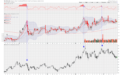
The Weekly Gold and Silver Ratio

The price of gold and silver are obviously important factors to anybody trading mining stocks. Both metals have many similar characteristics and both tend to move together on the charts. What is interesting is that gold and silver do not always move up or down by the same degree. Sometimes silver will be outpacing gold, and other times, gold will be in the lead. Experienced traders have learned to capitalize on what this means, and how it affects their portfolios. Below is a longer term weekly chart of the Silver ETF divided by the Gold ETF.


Beneath the ratio chart is a chart of XGD. This is an ETF that trades in Toronto, and contains a basket of international gold stocks. Being a Canadian, this is primarily what I trade, but I don't think that it is any better or worse than the American gold ETF, GDX.

Anyway, if you click on the chart, the first thing you will notice is the blue lines I have drawn. These lines are drawn when the ratio becomes overbought, and then, subsequently leaves overbought territory. These lines connect to the XGD chart below, and I feel that they have generated some very good sell signals. Keep in mind though that this is a weekly chart, which means that the signals may take several days to manifest. However, a benefit to this is that weekly signals tend to be more reliable than daily signals, and last for a longer periods of time. Sell signals could be generated from this chart, but since Silver has been doing so well over the last few years, it has never gotten oversold relative to gold on the weekly chart.

Another way I look at this chart is to use silver a leading indicator. Whenever silver has a much better day or week than gold, I view this as a positive development for gold stocks. Notice that the huge run up in XGD from the beginning of 2006 to May 2006 was accompanied by silver outpacing gold. After the May top, silver lead XGD on the way down. Like all other indicators or methods, I do not rely solely upon this chart, but it is an important tool in my tool box.

Thursday, June 21, 2007

The US Dollar and the Price of Gold

I think that it is safe to say that most gold traders keep an eye on the US Dollar. This is because the price of gold and the value of the US Dollar trend in the opposite direction. The reason for this is that gold is denominated in US Dollars, so when the dollar falls, it will take more dollars to buy an ounce of gold. It is therefore helpful to look at the USD as a means for analyzing the price of gold. Below is a daily chart of the USD with some of my own annotations that I use for my own trading.


Whenever I analyze the USD I look for overbought/oversold indications on the RSI indicator. If the Dollar is overbought, it has a greater probability of decreasing, which would be bullish for gold and gold stocks. However, it is important to realize that just because RSI is overbought does mean it will decrease, as RSI can always get more overbought. Because of this, I always look for a confluence of indications to strengthen my opinion.

Another important indication I look at when analyzing the USD is the position of the 200 day moving average. Since the Dollar is in a bear market, you will notice that it is trading below this level. Notice also that when the bulls push the price to the 200DMA, the bears step in, and take control. This occurred in the above chart in the middle of October, 2006. Furthermore, in the middle of October, the USD was in overbought territory, which added to the bearishness. You now had two pieces of evidence that the Dollar could fall. This is what I mean by a confluence of indications. Gold bottomed out at exactly the same time as the US Dollar topped.

Finally, I use support and resistance lines to help me understand the probable direction of prices. Notice that in the middle of April, 2007, the USD broke through the line of support I labeled R1. I labeled it R1 because broken support always becomes new resistance. Interestingly, R1 became resistance in late May, but subsequently broke through it in the middle of June. The next line of resistance, labeled R2, is the downtrend line. Like clockwork, the USD has ceased at this level, and headed south. Should this line eventual fail, then the third line of defense will be the 200DMA.

In summary, look for indications such as RSI, moving averages, and trend lines to help you understand the price of the USD, which, in turn, will help you understand the price of gold.

Australian Dollar and Gold

Today's post is a chart of the Australian Dollar. You may be wondering why I am talking about a currency when this is supposed to be a gold site. However, as Forex traders know, the price of gold and the value of the Australian Dollar exhibit a high degree of correlation. This correlation, which some say is as high as 85%, is partly due to the fact that Australia produces a tremendous amount of gold, and is generally considered to be a commodity currency.


In the above chart, the Australian Dollar is at the top, in the middle is an MACD histogram of the Aussie, and at the bottom is a chart of the XAU, which was discussed in the previous post. Notice that, even though the correlation is not perfect, the two charts tend to peak and trough at the same time. Sometimes, a bullish development can occur in the Aussie chart, which could not be seen in the gold charts. This would be considered bullish for gold. Astute traders can also take advantage of divergences. For example, if the XAU is grinding lower, but you notice that the Aussie has already turned around and started higher, this may give you an early clue that the XAU is liable to do the same. This sort of thing occurred near March 12, 2007. Please click on the chart to see an enlarged picture, and to read my comments. I think this chart is another good tool, but it always best to get a confluence of charts saying the same thing before making a trading decision. Anyway, hope this makes sense. See you at the next post.

Wednesday, June 20, 2007

The XAU and Why I Watch It

The chart below is of the XAU. The XAU is an index of gold stocks and trades in Philadelphia. Many gold analysts and traders look at the XAU, and make their trading decisions off of it, which is why it is important for us to look at it as well. Chances are that if you hold any gold stock, it will follow this index to at least some degree. No matter how strong the fundamentals are of any mining company, if this index goes down hard, your gold stock will too. In addition, I always prefer to look at indexes or ETFs rather than individual stocks, since there is a lot less noise, and erratic volatilty.

In the chart below, I have made quite a few annotations, so feel free to click on the chart to see more of my thoughts on previous XAU price action. In addition to the usual indicators like RSI and MACD, I have a ratio chart below the price. This ratio is the price of the Gold ETF, GLD, divided by the XAU. Surrounding this ratio are bollinger bands. Buy and sell signals are sometimes generated when the ratio lines leaves the bollinger bands. This sort of thing happened in the middle of October, 2006.


Things are looking fairly bullish for this chart. Notice that there is a W formation brewing, and it would be quite bullish if it follows through. Notice as well that currently, the XAU is above its 50 day moving average, which is another bullish development. The bears tried to push the price below this level yesterday, but the bulls were able to close it above. In the event of a small pullback, the 50 dma should now act as support. Please look carefully at the comments on the chart. Although they are of past price action, I think that they have a lot educational value.