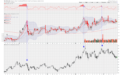
Beneath the ratio chart is a chart of XGD. This is an ETF that trades in Toronto, and contains a basket of international gold stocks. Being a Canadian, this is primarily what I trade, but I don't think that it is any better or worse than the American gold ETF, GDX.
Anyway, if you click on the chart, the first thing you will notice is the blue lines I have drawn. These lines are drawn when the ratio becomes overbought, and then, subsequently leaves overbought territory. These lines connect to the XGD chart below, and I feel that they have generated some very good sell signals. Keep in mind though that this is a weekly chart, which means that the signals may take several days to manifest. However, a benefit to this is that weekly signals tend to be more reliable than daily signals, and last for a longer periods of time. Sell signals could be generated from this chart, but since Silver has been doing so well over the last few years, it has never gotten oversold relative to gold on the weekly chart.
Another way I look at this chart is to use silver a leading indicator. Whenever silver has a much better day or week than gold, I view this as a positive development for gold stocks. Notice that the huge run up in XGD from the beginning of 2006 to May 2006 was accompanied by silver outpacing gold. After the May top, silver lead XGD on the way down. Like all other indicators or methods, I do not rely solely upon this chart, but it is an important tool in my tool box.

![[Most Recent Quotes from www.kitco.com]](http://www.kitconet.com/images/live/s_gold.gif)
![[Most Recent Quotes from www.kitco.com]](http://www.kitconet.com/images/live/s_silv.gif)


No comments:
Post a Comment