Sunday, February 24, 2008

Gold Stocks, the Euro, and a New ETF

Commodities had another spectacular week, with gold reaching yet another all time nominal high, and silver exploding higher by 6.29% in Canadian dollar terms. Oil was also strong this week, increasing by about 3.5%.

The first chart that caught my eye this week was a weekly chart of the XAU. Prior to this week, the stocks were underperforming bullion, but that may change:


My view is that gold stocks are recharging after the blistering rally that occurred in the fall. This consolidation is taking the form of a triangle, which should break out to the upside. The indicator at the bottom of the chart shows that the XAU is now trading closer to its 50 week moving average, which, in my opinion, shows that some of the overbought condition has been worked off, and gold stocks bulls have reloaded for another assault higher.

Another chart that is similar to the one above is a weekly chart of the Euro:


The main point here is that the Euro, like gold, is in a very strong uptrend. I've learned through experience that fighting trends is a losing game, usually even if there are indications of trend reversals. Luckily, in this case, the trend is up, and there are no signs, such as a bearish candle or overbought reading, that trend will reverse.

Trading with the trend is vitally important, but there are other tools one can use to assess the strength of a trend. One tool is using Commitment of Trader data, which I already showed in another post, so I won't show it again. Another is through intermarket analysis. The chart below uses intermarket analysis, and is a variation of a chart that I have attempted to explain here.
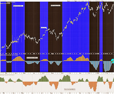

The MACD Histogram that is in black is derived from a ratio, and is independent from the Euro's price action. The MACD in white is a traditional MACD using data from the Euro's price action.

What I like about the first MACD is that you are not using price A to forecast movements in price A. For this reason, the first MACD has the potential to be a leading indicator, unlike a traditional MACD, which always will be a lagging indicator.

The leading MACD has just entered the Euro buy zone.

As you could probably guess by the creative title given to this post, I will now begin talking about a new ETF. This relatively new ETF follows the Rogers International Commodity Index, and the ticker symbol is RJA:


I mentioned earlier that trading in the direction of the trend is vitally important, which is why this ETF caught my eye. There are some really ugly black candles here, which are a result of investors placing market orders at or before the opening bell. The bottom half of this post explains why this is a bad idea.

What I really like about the above ETF is that you get a tremendous array of different commodities. Here is pie chart that show where your money would be put to work:


This ETF will give you exposure to areas that ordinary investors would likely otherwise never have access to. I know I am not prepared to invest in Lean Hogs or Lumber any other way. Soft commodities have been the top performing sector for this past year, even outperforming gold and silver, so having some exposure may be prudent.

Saturday, February 16, 2008

Platinum, Oil, and Chinese Stocks

Last week, precious metals were more or less flat, which is a bit unusual considering how strongly the Euro rallied. In this post, I'll show some charts that caught my eye this week.

Firstly, in the chart below, we have a chart of USO, the United States Oil fund ETF, beneath a chart of Crude Oil's Commitment of Trader structure. Using this technique is not perfect, but generally, clues can be obtained from watching the commercials, and keeping an eye on open interest:


The next chart shows a weekly chart of USO. This chart is a duplicate of a chart I featured and analyzed in this article. As you can see, this ETF is grinding against the red resistance area that is atop the price action. As it is consolidating, it is working off its overbought condition, which can be shown by the indicator on the bottom. I feel that Crude Oil could be winding up for a big move.


With about 90% of my investments tied up into precious metals and commodities, I thought it might be wise to explore some other profitable opportunities. Another area that I think has a lot of potential is China. I am currently reading Jim Roger's new book, A Bull in China, and he makes a good argument.

One way to play Chinese stocks can be through ADRs, which is more risky, or through ETFs, which give you a basket of stocks. One such ETF is FXI, and here is a daily chart of it below:


I was somewhat nervous investing in the Chinese market a few months back because of the frothiness that was building up. However, if you look at the Hang Seng, which is the main index for Hong Kong stocks, you will see that it is no longer overbought, after correcting 36% in the last 3 months:


Finally, another chart that caught my eye was a chart of platinum. I feel bad that I was never able to capitalize on this massive move. I always felt that, for political reasons, South Africa would inevitably descend into third world status, and I knew that 80% of platinum is mined in South Africa, but I was never able to put 2 and 2 together.

Platinum production in South Africa has plummeted due to that country's inability to supply electricity to its mines.


It is also worth mentioning that South African mining stocks should always be avoided without exception. Unfortunately, some of the major ETFs, such as XGD, have South African exposure, but it is not too significant. Two mining operations that I like, and that are in politically stable regions are Agnico Eagle Mines, and Silver Standard Resources.

Sunday, February 10, 2008

Technical Charts of the Forex and Gold Markets

Last week began with gold getting hit quite hard by the bears, but ended with gold actually up by about 9 dollars. Gold held up surprisingly well considering the Euro basically collapsed at a key level of resistance last week.

Let's have another look at the Euro Index to see what we can expect to see next. The following image shows a chart of the Euro's Commitment of Trader structure on the top, and a candlestick chart of the Euro on the bottom:


Presently, the commercials have dramatically reduced their short position. In fact, they are getting close to being net long, which I have never seen happen before. You always want to keep a close eye on the commercials, since they usually represent the smart money. Therefore, this represents a very bullish development for the Euro, in my opinion.

Putting my college education to work, by using MS Paint, I have drawn green circles in the above chart representing previous occasions where the commercials reduced their shorts. As you can see, these were all good entry points.

Bearish signals are generated when the large speculators become excessively long, or if open interest peaks.

If gold can rally when the Euro is falling, I think it means that gold is in strong hands right now. Gold, silver, and gold stocks are all in strong uptrends, and it would be foolish to fight these trends.

The next chart shows the relationship between gold bullion, and gold stocks on the top, and a daily chart of XGD on the bottom:


In the above chart, the top panel vacillates between areas where gold stocks are expensive relative to gold bullion, and areas where gold stocks are cheap relative to gold bullion. Presently, the RSI of the ratio is in oversold territory. As indicated by the yellow zones, these occasions have represented good gold stock buying opportunities.

An alternative strategy involving the above chart would be to go long gold stocks and to go short gold bullion. One could do this by simultaneously buying HGU.to and buying HBD.to. This would represent a low risk, low reward play, in my opinion.

Further Recommended Reading:

1) Canadian Point and Figures
2) Guerrilla Investor

Friday, February 1, 2008

Charts of the Euro ETF, the USDX, and Gold

For this week, gold reached new all time highs yet again. Gold seems to be getting a little frothy again, and a pull back may come next week. That being said, the trend is still clearly up, so I would not bet money against this market.

Gold could potentially run into trouble if the US Dollar Index is able to find support. The USDX is in the 75 zone, which was support last time around. If there is a bounce, I expect it to be a feeble one. I have a hard time believing that the USD will be able to penetrate back through the prior support area of 80:

The next chart is a daily chart of an ETF that follows the Euro/USD currency cross. As you can see, this ETF is at what potentially could be a triple top. If the Euro fails at the red line, I would expect it to retreat to the green line. Once the Euro eventually gets past this resistance area, it would likely signal a new wave higher.


John Murphy recently said that he thought a bullish cup and handle formation was forming in the above chart. Although that is possible, and I have set my stops accordingly, I still doubt that the Euro will break above resistance this time around.


You'll probably have to refer to this article to make heads or tails of the above chart. Essentially, it is indicating that caution should be taken in the precious metal markets right now. I would not be chasing gold higher at this time.

Any pull backs represent long term buying opportunities, since the long-term trend is up. This post was written on Friday morning, but released on the weekend.