In last week's post, I suggested that gold priced in Canadian Dollars was testing a key level of resistance. Last week's price action has proven that it has failed quite miserably at this test. The chart below illustrates this point.
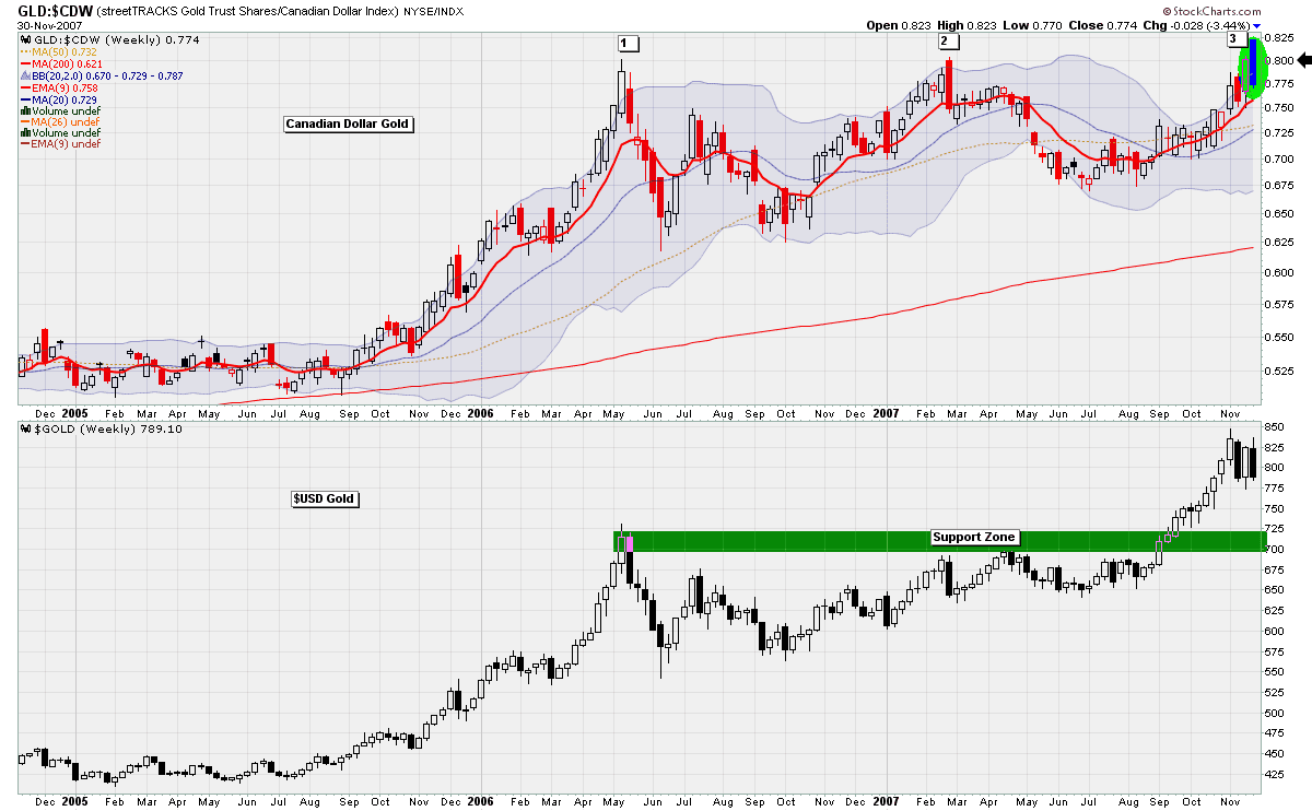
The candlestick formation that formed at this level of resistance is also noteworthy. The combination is what is known as a dark cloud cover. Steve Nison, author of Japanese Candlestick Charting Techniques, says the following about this pattern:
The rationale behind this bearish pattern is readily explained. The market is in an uptrend. A strong white candlestick is followed by a gap higher on the next session's opening. Thus far, the bulls are in complete control. But then no continuation of the rally occurs! In fact, the market closes at or near the lows of the day moving well within the prior day's real body. In such a scenario, the longs will have second thoughts about their position.
But it is not only Canadian Gold that has failed at a key area of resistance, but Crude Oil too. I showed this following chart several posts ago, but I thought it would be good to have an update on the oil situation:

This chart shows a weekly perspective on the Oil ETF, USO. In my opinion, the price has been struggling at the resistance area highlighted. Furthermore, the chart put in a large red candle for this week, with no lower shadow, on decent volume. There is nothing bullish about that sort of combination.
In Friday's edition of John Murphy's Market Message, John Murphy pointed out that the CRB and GSCI commodity indexes were also at resistance. This makes sense, since these indexes are heavily weighted in crude oil.
Finally, let's have a look at a daily chart of the US Dollar:

Ever since the US Dollar broke through the key support area of 80, it has been getting creamed very badly. However, it seems that the US Dollar bears may take a bit of break for the next couple of weeks as shown by some of the bullish developments in the above chart.
Firstly, the USD put in a dragonfly doji right on the 75 mark. The fact that the bulls were able to defeat the bears at this level is encouraging. In addition, the MACD Histogram has given us a buy signal for the first time in months. If the US Dollar begins to rally, it will certainly bring commodity prices down. If you agree or disagree with this analysis please leave a comment. Thanks for visiting.
For additional analysis, I recommend the following 2 blogs:
Canadian Point and Figures
Headline Charts

![[Most Recent Quotes from www.kitco.com]](http://www.kitconet.com/images/live/s_gold.gif)
![[Most Recent Quotes from www.kitco.com]](http://www.kitconet.com/images/live/s_silv.gif)


5 comments:
The MacD Histogram on your $USD chart is striking. However I do not get the same read out with the standard parameters on a $USD chart run at Stock Charts (theirs are 12,26,9). Do you mind telling me what are your parameters? Regardless, it is also interesting that the standard 14 day RSI put in a 'clear' positive divergence well above 20 when the $USD hit its most recent low (whereas it pretty much hit 20 in 3 previous sell offs). For whatever reasons, it looks like a strong (short-term) rally back to your noted resistance area is in the cards.
Hi Milt,
Thanks very much for the question. The parameters I used for that chart are 21,34,21. And you are right, the standard parameters set by Stockcharts.com will give you a different result.
I like the parameters I use because I find that it is less susceptible to whipsaws. The only downside is that it is also less responsive.
I also agree with you on your RSI analysis. A USD Dollar rallying seems quite possible in the next few weeks.
But, since anything can happen, I would consider canceling bets if the USDX breaks through the 75 mark.
Hi, Danny,
This is slightly off the current topic, but I think relevant to your blog and technical analysis in general...
On your recent post titled, "60 Minute Gold Charts and Gaps" you asserted that a gap-up from 63.99 was filled when XGD touched 64.00, even though there is still a .01 gap there. Is a gap technically filled in the minds of most traders when it is reduced to .01 like this? Or is does it usually have to be closed completely?
(I'm asking this question because I'm long a stock that is currently trading at 7.00+ with a gap from 4.39 to 4.40 from about 2 years ago, and I'm not sure how much I should let this gap sway me into selling.)
Thanks in advance for your thoughts.
Chris
NJ
Hi Chris,
In the example of XGD that was posted, I would say that the market had closed that gap, and that gap acted as support for the ETF.
Even if there had been a 25 cent space between filling the gap, I would say that it was filled. The bid/ask spread for this ETF is around that amount anyway.
You should post the ticker sybmol for your stock. I would like to have a look at it.
My email address is DannyMerkel@hotmail.com
Thanks.
Hi, Danny,
The ticker is SMSI, and the gap opened on 8/29/05.
Thanks,
Chris NJ
Post a Comment